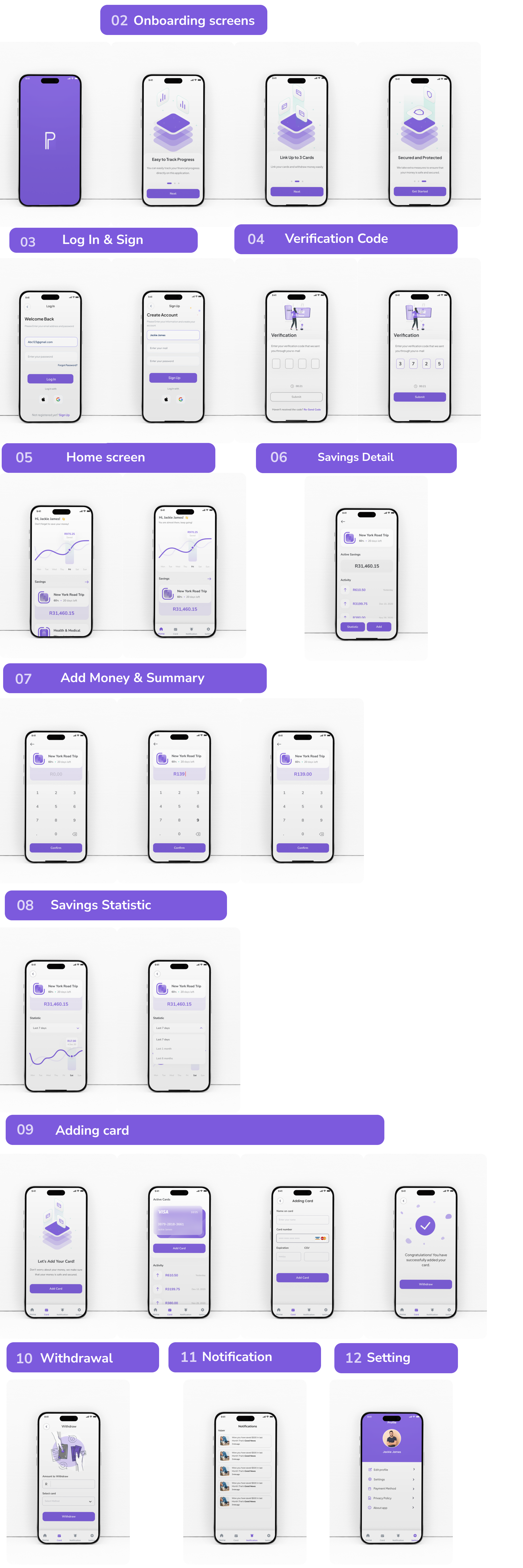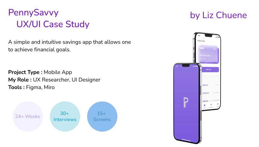
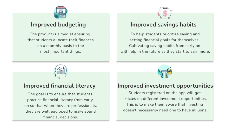
A budgeting and savings app called PennySavvy was created to assist college students in reaching their financial objectives and improving their money management. To promote wise financial practices, the app provides tools including goal-setting, automated saving options, spending tracking, and a rewards system.
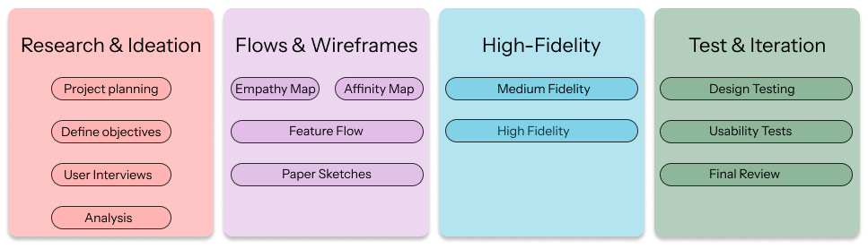
In my UX design process, I start by understanding users and defining their needs, then move on to ideating, designing, and testing solutions. I iterate based on feedback to create intuitive and effective user experiences.

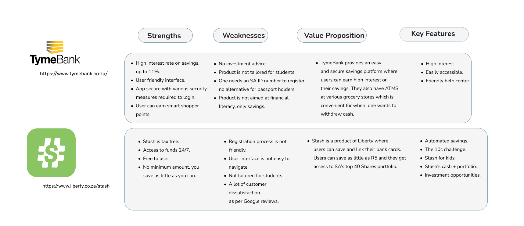
I conducted a competitor analysis to understand the strengths and weaknesses of similar apps in the market. This helped me identify opportunities for differentiation and improvement.
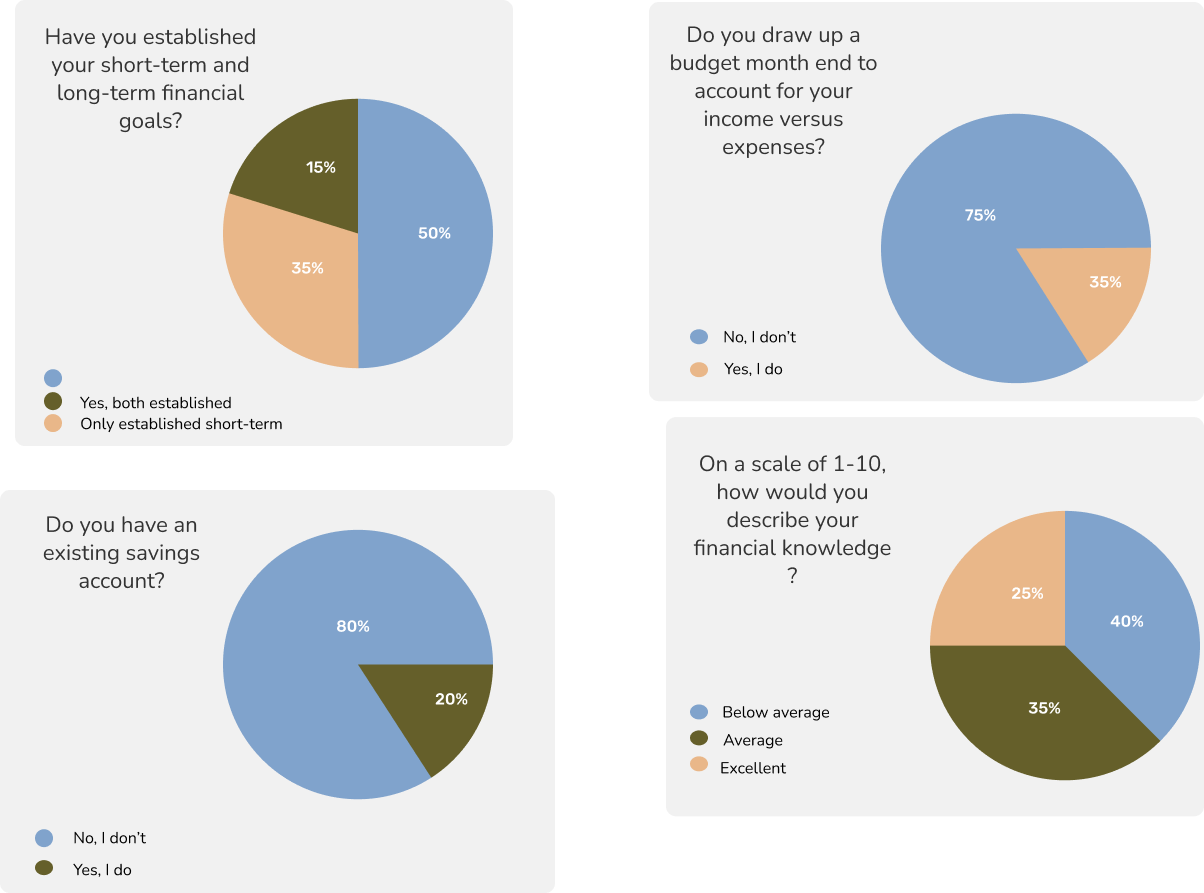
This step is crucial for building empathy with users and identifying real problems to solve. By grounding my designs in research, I can created more intuitive and user-friendly experiences. This research was conducted in the form of a questionnaire where students recorded their responses using Google forms. A total of 58 students responded to all questions and I was able to put together my quantitative research.
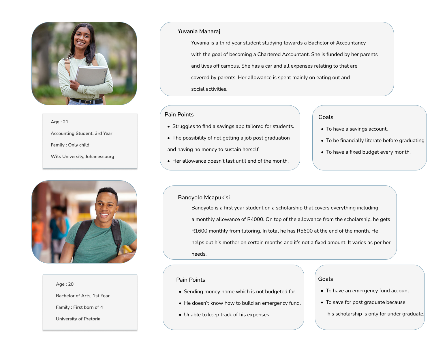
I created user personas to represent key types of students who would use the app, based on research insights. They helped me stay focused on real user needs and guided design decisions to ensure the app is relevant and user-friendly.
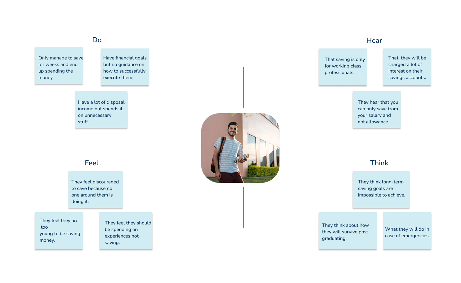
I created an empathy map to better understand what users think, feel, say, and do when managing their finances. It helped me gain deeper insight into their motivations and challenges, allowing me to design a more meaningful and supportive user experience.
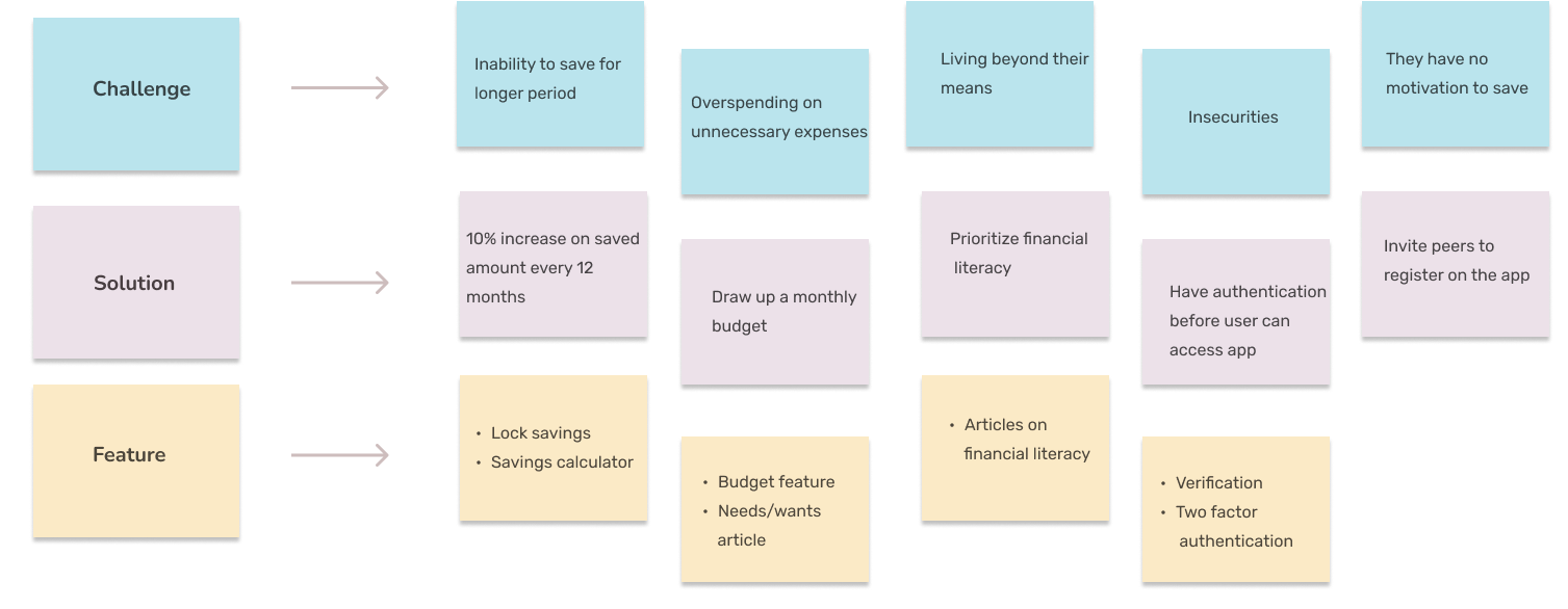
I used an affinity diagram to organize and group insights from my research into clear themes. This helped me identify patterns in user behavior and needs, making it easier to define key problems and focus areas for the design.
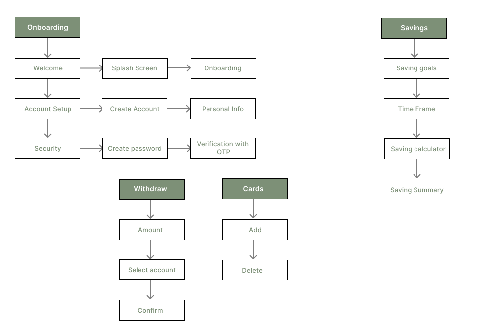
I created an information architecture to plan the app's structure and organize content in a logical, user-friendly way. It helped ensure that users can easily navigate the app and find what they need without confusion.
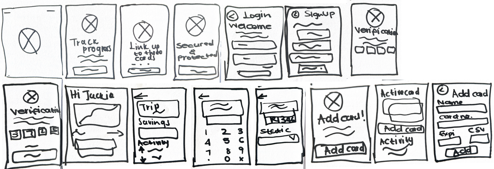
I created hand-drawn sketches to quickly visualize layout ideas, which allowed me to iterate rapidly and experiment with different UI elements for the website.
I created medium-fidelity wireframes for the savings app to strike a balance between visual clarity and design flexibility. At this stage, the focus was on refining the layout, user flow, and core interactions without getting distracted by detailed visuals or branding. Medium-fidelity wireframes allowed for effective feedback from stakeholders and potential users, helping to validate the app's structure and usability.
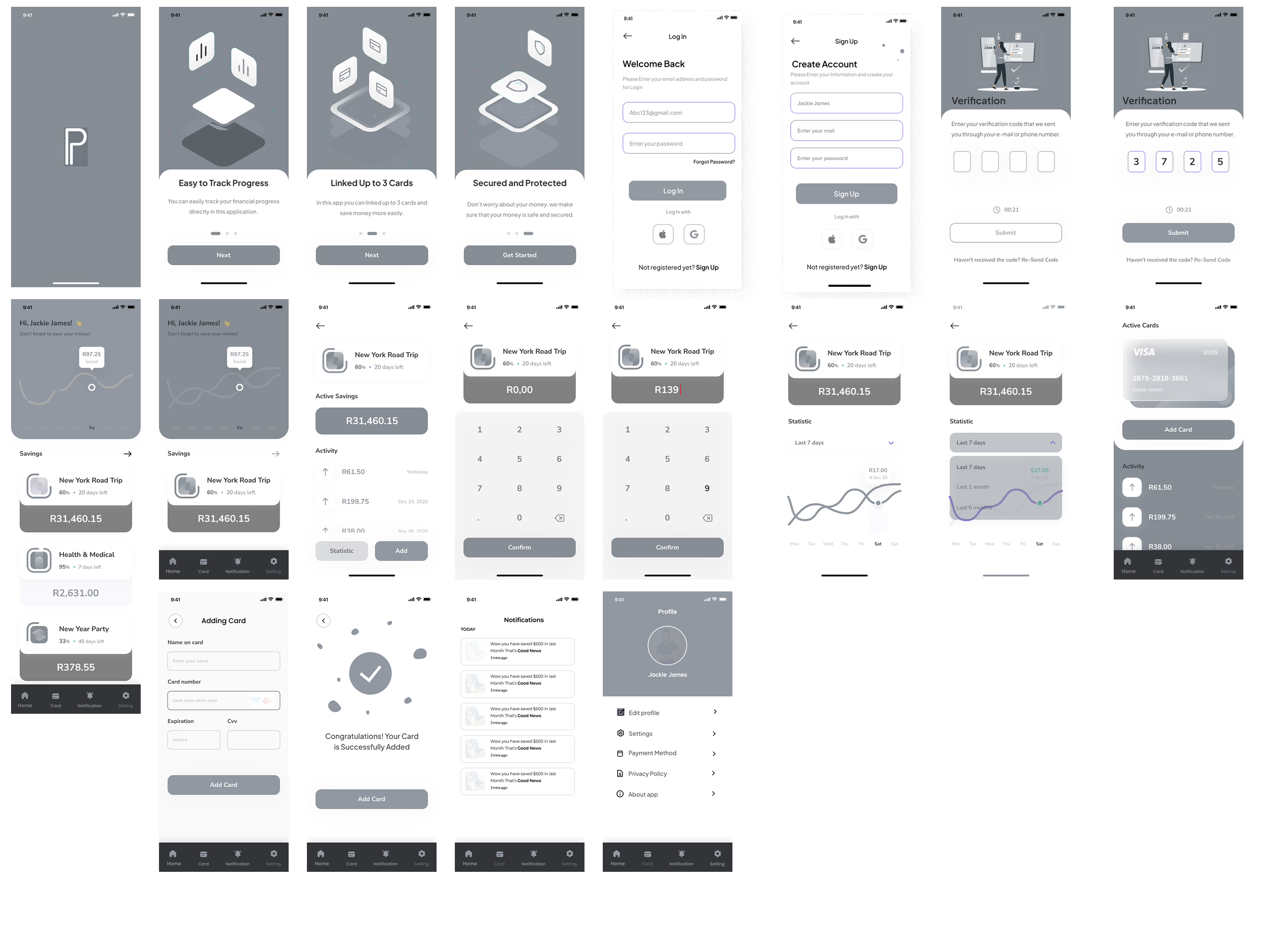
I designed high-fidelity wireframes for a savings app tailored to university students, focusing on simplicity and ease of use. My goal was to create an intuitive interface that encourages goal-based saving and smart expense tracking. Through user feedback and iteration, I refined the design to ensure it truly supported students' financial habits.