← All work

Case study 03 · UX research & UI design

Cool Kind Co.

A help centre designed for people who have already been on hold for half an hour.

The research here didn't need much interpretation. Twenty-four verbatim complaints, four unmistakable clusters, and one sentence underneath all of them: I could have fixed this myself if you'd let me. So the product's first job isn't to answer questions faster — it's to stop generating them.

Role
UX research, UI design, prototyping
Scope
Concept through high-fidelity responsive prototype
Platform
Web — desktop and mobile
Methods
User research, affinity mapping, personas, task flows, sketching
Output
7 screen types, desktop and mobile, fully linked prototype

01 — Overview

Support is a design failure by the time it starts

Cool Kind Co. is a customer support platform built around one principle: the best support experience is the one that doesn't need an agent.

It has four parts. A help centre where common problems are actually solvable — password resets, locked accounts, failed payments. An AI assistant that troubleshoots step by step and knows when to stop. A reporting and tracking system, so nobody has to explain the same issue three times. And a human route that stays open, clearly labelled, for the cases that genuinely need one.

The measure of success isn't chat volume. It's how many people never have to open the chat at all.

02 — The problem

Thirty minutes and still explaining

What people are up against

Getting help costs more than the problem does. People wait half an hour to reach a person, get disconnected, call back and start again from the beginning. The website they were on offers no self-service, no status on anything they've reported, and no straightforward answer to “when is support even available?”

Meanwhile the two things people most often need help with — logging in and paying — are exactly the two things a well-built interface could let them fix alone. Every locked account escalated to a call is a design decision someone made earlier.

The goal

What I set out to build

A support experience where the common cases resolve without a queue, the uncommon ones are visibly in progress, and nobody has to repeat themselves.

  • Solve the top four issues without contacting anyone
  • Give every reported issue a reference and a live status
  • Explain payment failures in the words a customer used
  • Keep the human route visible — never hidden behind a bot

03 — Process

UX first, UI second

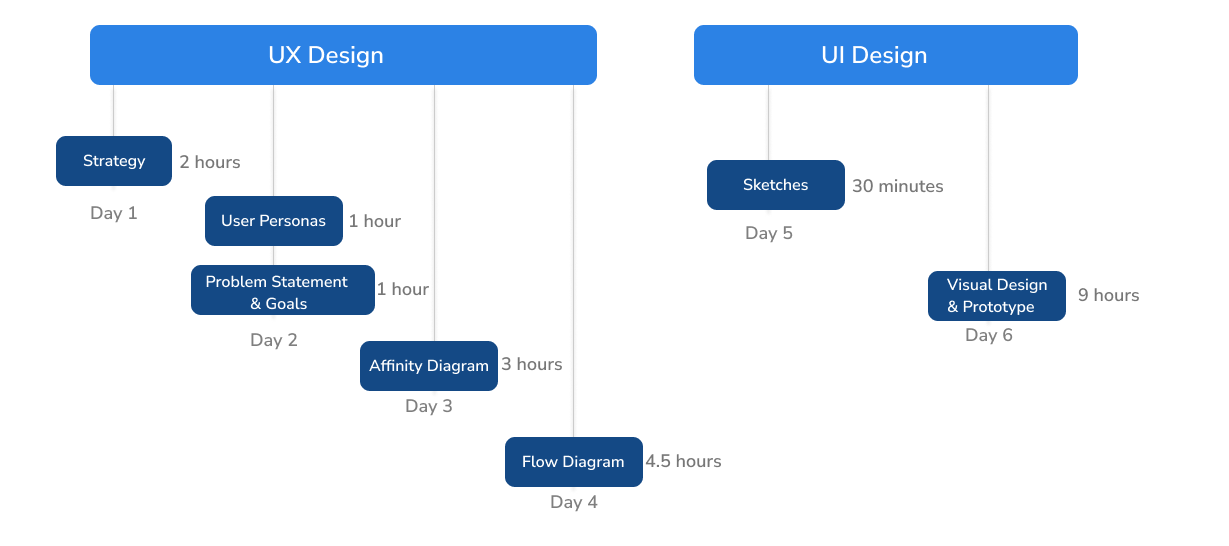
The project ran as two connected tracks. Everything on the left had to be finished before anything on the right began — strategy, personas, a problem statement, the affinity board, the flow. Only then did the sketching start.

Project timeline: a UX track covering strategy, personas, problem statement, affinity diagram and flow diagram, followed by a UI track of sketches and visual design.
The two tracks and their order

04 — Research & affinity mapping

Twenty-four complaints,
four themes

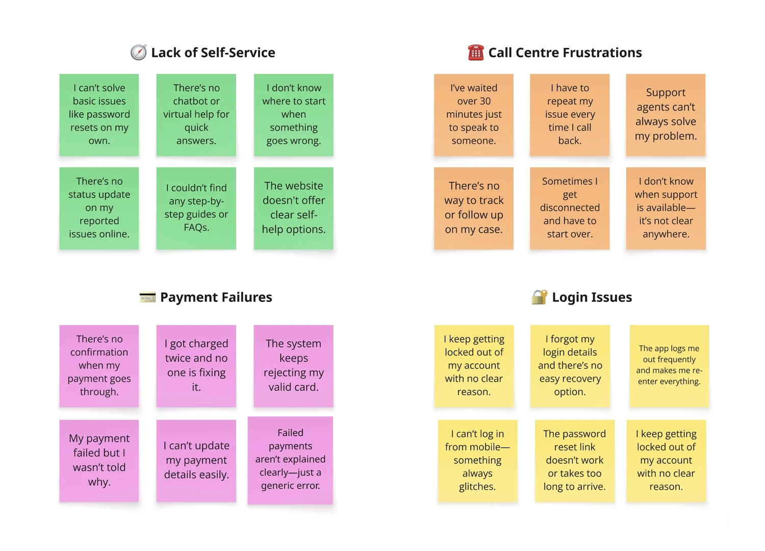
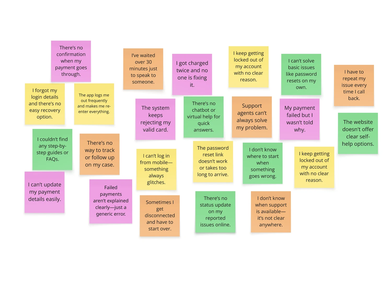
I collected support complaints verbatim and put every one on the board without grouping them first — the point of an affinity diagram is that the categories come out of the data rather than out of my expectations. The board sorted itself almost immediately, which is usually a sign the problem is structural rather than incidental.

The sorted affinity board: four themed clusters covering self-service, call centre, payments and login. The raw affinity board: twenty-four verbatim complaints on coloured notes, ungrouped. RawSorted
Drag across — the same twenty-four complaints, before and after sorting
01

Lack of self-service

“I can't solve basic issues like password resets on my own.” No guides, no FAQs, no chatbot, no status on anything reported.

02

Call centre friction

“I've waited over 30 minutes just to speak to someone.” Disconnections, repetition, and no visibility of when support is open.

03

Payment failures

“I got charged twice and no one is fixing it.” Rejected valid cards, unexplained failures, no confirmation when payment works.

04

Login issues

“I keep getting locked out with no clear reason.” Reset links that don't arrive, sessions that expire, mobile that won't authenticate.

Two of these four themes — payments and login — are the product's own doing. The other two are what happens when a company has no answer for the first two. That framing set the priority order for everything that followed.

05 — Personas

Two people, one refusal to wait

The research split into people who want the tools to fix it themselves, and people who want to be walked through fixing it themselves. Both want the same outcome; they need different amounts of hand-holding to get there. Designing for both is what keeps an AI assistant from becoming either a search box or a babysitter.

Persona 01 — The self-server

Hailey

“I want to find answers and resolve issues on my own, without having to wait for support.”

  • 31
  • Cape Town
  • Lawyer
  • Masters
  • Single
What she wants

A knowledge base or an AI assistant that gives instant answers and guides her through troubleshooting — access to the information she needs, at her own convenience, at any hour.

Frustrations
  • Long wait times on calls to the call centre
  • Recurring payment issues, every month
  • Having to follow up repeatedly on discrepancies
  • Complicated processes and slow, unclear communication
What that means for design
  • Answers must be reachable without a conversation
  • Payment history and status must be self-evident
  • Every reported issue needs a reference she can follow
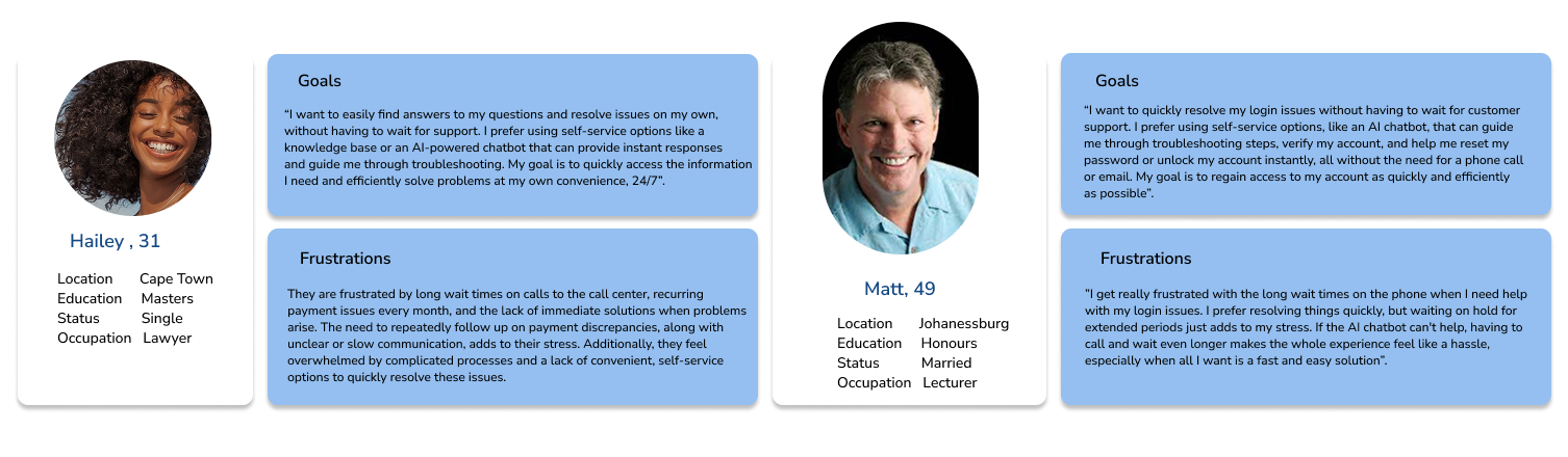
Persona 02 — The guided troubleshooter

Matt

“I just want to get back into my account without waiting on hold.”

  • 49
  • Johannesburg
  • Lecturer
  • Honours
  • Married
What he wants

An AI assistant that walks him through troubleshooting steps, verifies his account and helps him reset his password — regaining access without a phone call or an email thread.

Frustrations
  • Long phone waits when he needs help logging in
  • Extended hold times that add to his stress
  • Being made to call after the chatbot fails
What that means for design
  • Recovery is a guided sequence, not a link
  • Verification happens inside the flow, not on a call
  • If the assistant can't help, escalation must be one step — never a restart
The two Cool Kind Co. personas as designed, with goals and frustrations.
Personas as delivered

06 — From theme to decision

Four themes, four things the site had to do

Theme 01

Solve it yourself

What people said

“I can't solve basic issues like password resets on my own.” “There's no chatbot or virtual help for quick answers.” “The website doesn't offer clear self-help options.”

What I designed

A help centre landing page that leads with resolution, not with a contact form. Quick resolution, FAQs and the assistant are the three things above the fold — because the person arriving here already knows what's wrong.

Theme 02

Don't make me repeat myself

What people said

“I have to repeat my issue every time I call back.” “Sometimes I get disconnected and have to start over.” “There's no status update on my reported issues online.”

What I designed

Reporting an issue produces a reference immediately, confirmed on screen. My Queries lists everything ever raised with its status, and Track Issue answers “what's happening with mine?” without a conversation.

Theme 03

Explain the money

What people said

“My payment failed but I wasn't told why.” “I got charged twice and no one is fixing it.” “There's no confirmation when my payment goes through.”

What I designed

Payment is a first-class category in the assistant, with the failure reason stated in plain language and a route to dispute a duplicate charge. Confirmation is explicit — a silent success is the same as a failure to the person paying.

Theme 04

Get me back in

What people said

“I keep getting locked out of my account with no clear reason.” “The password reset link doesn't work or takes too long to arrive.” “The app logs me out frequently and makes me re-enter everything.”

What I designed

Account recovery runs as a guided sequence with verification built into it, so Matt never has to leave the flow to prove who he is — and the reason for a lockout is stated rather than implied.

07 — The idea, working

Pick a problem. Watch it not become a phone call.

This is the central interaction of the whole product, built here so you can use it rather than read about it. Four categories, because the research produced exactly four. Each one resolves in place — and each one keeps a visible route to a human, because hiding that is how support pages lose people's trust.

Cool Kind Co.Help Centre

How can we help you today?

Choose a category and I'll take it from there — most issues resolve here in under a minute.

Why it's built this way

  • Four categories, not a search box. A search field asks the person to name their problem correctly. The research says they can't — they say “it keeps logging me out”, not “session expiry”.
  • Steps, not paragraphs. Matt needs to be walked through it. Numbered actions with one instruction each are what a stressed person can follow.
  • Verification inside the flow. The most common reason support calls exist is proving identity. Doing that in the assistant is what removes the call.
  • The human button never moves. It sits in the same place at every step. An assistant that traps you is worse than no assistant.
  • Every path ends with a reference. If it isn't solved here, it leaves with a number attached — so the next conversation starts where this one stopped.

08 — Sketches

Deciding on paper

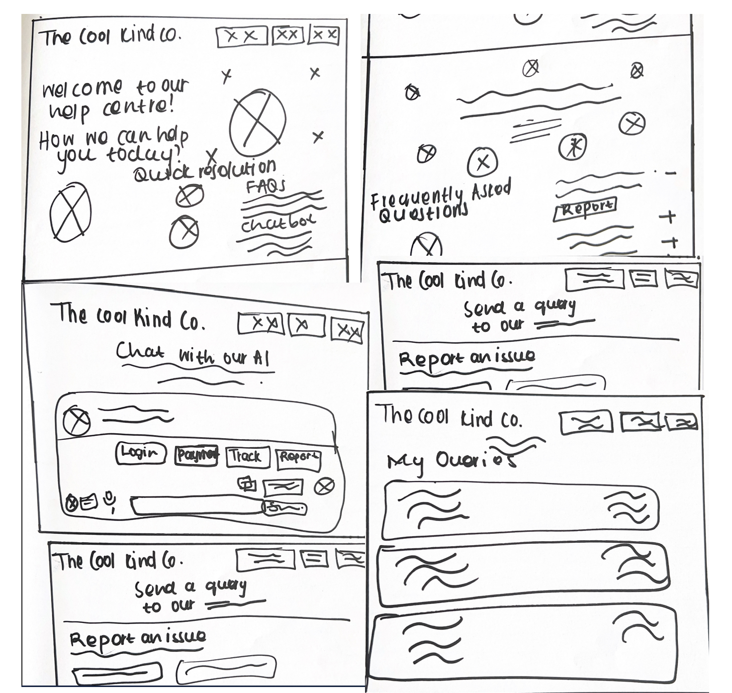
Five screens, drawn by hand, in the time it would take to lay out one properly. The purpose was to settle three arguments cheaply: does the assistant live on the homepage or its own page, does reporting an issue belong with contact, and what does the queries list look like when you have four open at once.

Hand-drawn sketches of the Cool Kind Co. help centre, FAQ page, AI chat, report an issue and my queries screens.
Help centre · FAQs · AI chat · Report an issue · My queries

09 — High fidelity

Seven screens, two breakpoints, one route through

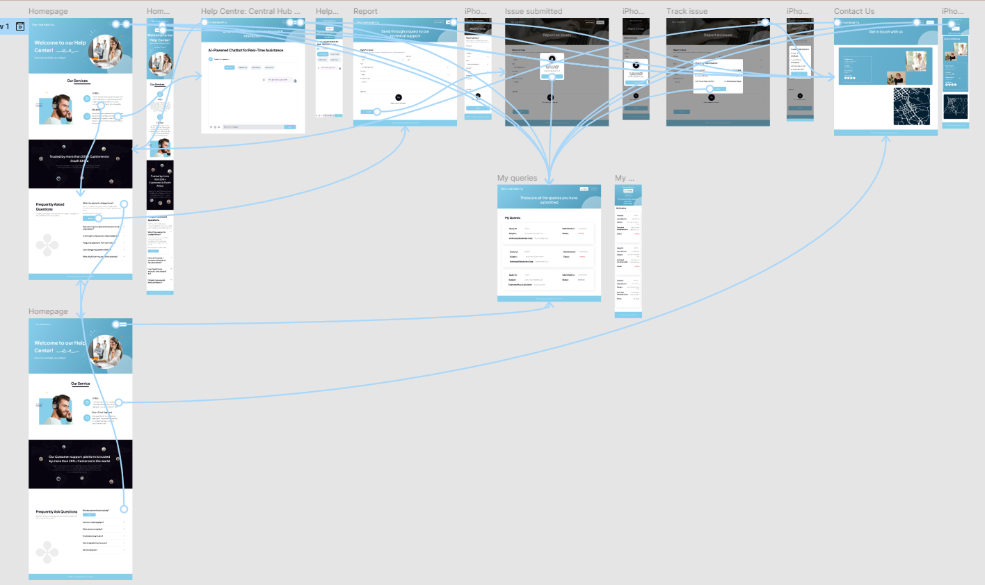
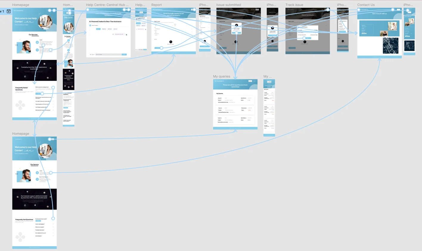
The prototype is fully linked, desktop and mobile, so the whole journey can be walked: land, self-serve, ask the assistant, report, get a reference, track it, and — if it comes to it — contact a person. Blue and white, deliberately plain. A support page is not the place to be interesting.

The complete Cool Kind Co. prototype map showing homepage, help centre hub, AI chatbot, report, issue submitted, track issue, my queries and contact screens in desktop and mobile.
The full prototype map — every screen and every connection

Click to view full size

Homepage

Leads with “Welcome to our help centre”, then services, then social proof, then FAQs. The FAQ block is deliberately the tallest element — it's the cheapest resolution available.

Central hub

The AI assistant with category chips and a free-text field. Categories first, because naming the problem is the hard part for the person, not for the system.

Report → submitted

A short form and an unambiguous confirmation with a reference. The modal exists to make one point: something happened, and here's the proof.

Track issue

Enter the reference, see where it is. This screen exists purely because “there's no status update on my reported issues online” appeared on the board three times.

My queries

Everything raised, with status, in a table. It's the answer to repeating yourself: the history is on the customer's side of the glass, not only on the agent's.

Contact us

Kept, and kept visible. The goal was never to eliminate human support — it was to stop spending it on password resets.

10 — Reflection

What I'd do next

Honest assessment

The affinity board here is genuinely strong — the four themes are clean and every screen traces back to one. What the project doesn't yet have is proof that an AI assistant is the right shape for the answer. That's an assumption I inherited from the brief and then designed around, and it deserves testing rather than trusting.

  • Test the assistant against a plain FAQ. Same four problems, two routes, measure time-to-resolution. Half of these might not need a conversation at all.
  • Design the failure state properly. What the assistant says when it can't help decides whether the person trusts the next thing it says.
  • Write the payment error copy with a support agent. They already know which explanations calm people down and which ones start arguments.
  • Accessibility pass on the chat. Live regions, focus management, and a keyboard path through every step — a support tool that excludes people is a contradiction.

Next case study — 01

HealthyHabits →

Wellness & wellbeing tracker · Mobile