← All work

Case study 01 · UX research & UI design

HealthyHabits

A wellness and emotional wellbeing tracker for people whose weeks don't cooperate.

Most wellness apps ask for more effort than the habit itself. HealthyHabits is built the other way round: log in seconds, see the pattern, and get a nudge that suits the day you're actually having.

A visible run of days is the thing this product has to produce. Every decision below was measured against one question: does it make that run easier to keep?

Role
UX research, UI design, prototyping
Scope
Concept through medium-fidelity prototype
Platform
Mobile, iOS & Android
Methods
Interviews, surveys, competitive audit, personas, empathy mapping, journey mapping
Output
2 personas, 2 empathy maps, journey map, storyboards, lo-fi wireframes, medium-fidelity screens, test plan

01 — Overview

A tracker that gets out of the way

HealthyHabits tracks the four things people actually named when asked what slips first: movement, hydration, sleep and mindfulness.

Around those four, the app does three jobs. It sets goals small enough to hit on a bad day. It shows progress as a pattern rather than a score. And it sends reminders that read the person's own logged behaviour instead of a generic schedule.

What separates it from the tools people had already abandoned is restraint. One screen carries the day. Everything else — history, insights, settings, custom habits — sits one level down, reachable but never in the way. Customisation is offered as a choice, not as setup work you have to finish before the app becomes useful.

02 — The problem

Intent isn't the missing piece

What people are up against

People rarely fail at wellness for lack of wanting it. They fail for lack of structure, momentum and guidance that fits the week they're in.

The tools meant to help often make it worse. Cluttered interfaces, manual logging that takes longer than the habit, and advice general enough to apply to no one in particular. So the app gets downloaded, used for four days, and quietly forgotten.

The goal

What I set out to build

A tracker that is fast to use, simple to personalise and honest about progress — one that helps someone build a habit that survives a bad week, not just a good one.

  • Logging a habit takes one tap, not a form
  • Goals are set small enough to hit under pressure
  • Progress is shown as a pattern, not a verdict
  • Reminders come from behaviour, not a fixed clock

03 — Process

Four phases

The work moved in order, and each phase produced something the next one needed. Nothing here was decorative — every artefact below was made to answer a question that was blocking the design.

1

Research

  • Problem statement
  • User interviews & survey
  • Competitive audit
  • Personas
  • Empathy maps
  • Journey mapping
2

Structure

  • Storyboards
  • Task flows
  • Sketches
  • Lo-fi wireframes
3

Interface

  • Medium-fidelity screens
  • Visual language
  • UI kit & iconography
  • Accessibility review
4

Validation

  • Usability testing
  • Cognitive walkthrough
  • Think-aloud sessions
  • Synthesis & iteration

04 — Research

What I heard, and what I did about it

I ran interviews and a short survey with people who had tried a wellness app and stopped, then audited five apps they had abandoned. Three patterns came up often enough to design against. Each one below is paired with the decision it produced.

Finding 01

Consistency breaks before motivation does

What I heard

People described starting strong and then losing the thread after a disrupted week. The apps they used had nothing to catch them at that point — no smaller version of the goal, no acknowledgement of partial progress, no way back in that didn't feel like starting over.

What I did

Goals break into milestones small enough to hit on a bad day. Streaks show the shape of a month rather than a pass or fail, so one missed day reads as one missed day. Reminders are timed against the person's own logged pattern.

Finding 02

Feature-heavy interfaces get abandoned first

What I heard

Participants opened apps during short gaps in the day — a break, a commute, a queue. When the first screen demanded navigation or a decision, they closed it. Two people described abandoning an app during setup, before logging anything at all.

What I did

One screen carries the whole day: four habits, one tap each. History, insights and custom habits live one level down. Onboarding ships with preset habit templates so the app is useful before it is configured.

Finding 03

Generic advice reads as advice for someone else

What I heard

Broad recommendations were dismissed quickly. People could tell the app didn't know anything about them, and a suggestion that ignores a night shift or a school timetable actively undermines trust in everything around it.

What I did

Insights are derived from the person's own logged data — when they tend to slip, which habit carries the others, what a realistic next target looks like. Nothing is suggested that the app hasn't observed.

05 — Personas

Two people to design for

The research split cleanly into two groups: people who already track things and want less friction, and people who have never tracked anything and want to be shown how. Designing for both kept the interface from drifting toward either extreme.

Portrait of Sophie Ranks, a woman in her thirties holding a mug in a cafe.
Persona 01 — The busy professional

Sophie Ranks

“I need a wellness app that fits into my busy lifestyle.”

  • 36
  • London, UK
  • Product Manager
  • Bachelor's degree
  • Single
  • Currently uses BetterHabits
Background

Sophie works full-time in a fast-moving start-up. Long hours, client meetings and tight deadlines crowd out everything else. She wants a better sleep pattern and to drink more water, but her schedule keeps winning.

Traits
  • Organised, frequently overloaded
  • Goal-oriented and competitive
  • Motivated by visible progress
  • Prefers plain, distraction-free interfaces
Goals
  • A morning and evening routine she keeps
  • Better hydration and sleep quality
  • Small mindfulness breaks inside the workday
  • Milestones small enough to actually reach
Pain points
  • Existing apps feel cluttered and slow
  • Recommendations that ignore her schedule
  • Forgets to log, so her data has holes
  • Work, fitness and rest compete for the same hours
Portrait of Thabo Dlamini, a man in his late twenties, against a grey background.
Persona 02 — The health-conscious beginner

Thabo Dlamini

“I'd like to adopt a healthier lifestyle, but I'm not sure where to begin.”

  • 29
  • Hampshire, UK
  • High school teacher
  • Diploma
  • Married, two children
  • Beginner tech user
Background

Thabo's doctor recently flagged slightly elevated blood pressure and advised more movement, more water and less stress. He owns a smartphone but isn't confident with apps, and complicated ones put him off quickly. He wants a clear, practical route to better health at his own pace.

Traits
  • Calm and considered
  • Health-conscious, family-oriented
  • Prefers precise, step-by-step instruction
  • Motivated by small wins over big targets
Goals
  • A regular exercise routine that isn't overwhelming
  • Two litres of water a day
  • Guided breathing to manage stress
  • More energy and better sleep
Pain points
  • Loses consistency without reminders or structure
  • Finds most wellness apps confusing
  • Discouraged when results aren't immediate
  • Needs guidance tied to his own health goals
  • Has to balance family, work and himself

06 — Empathy maps

Beneath what people say

Mapping what each persona says, thinks, does and feels exposed the gap that mattered most: both of them describe wanting consistency, and both of them behave in ways that make consistency hard. The design has to close that gap rather than ask them to.

Says
  • “I need a wellness app that fits into my busy lifestyle.”
  • “I don't want to waste time logging everything manually.”
  • “I wish I had a visual way to track my progress.”
  • “Notifications help me, but I hate when apps overdo it.”
  • “I want achievable goals, not something unrealistic.”
Thinks
  • Is my current lifestyle affecting my long-term health?
  • There has to be a simpler way to manage this.
  • I need an app that adapts to my schedule, not the reverse.
  • Is tracking worth the effort if I can't stay consistent?
  • I want insights about me, not advice in general.
Does
  • Opens wellness apps during work breaks, closes them if they look complicated
  • Sets goals, then rarely revisits them
  • Reaches for coffee more often than water
  • Joins guided meditation sessions occasionally, when she remembers
  • Reads health articles she doesn't act on
Feels
  • Squeezed — a demanding job leaves little room for herself
  • Overwhelmed by apps carrying features she'll never use
  • Pulled off track by constant work interruptions
  • Demotivated when results don't show quickly
  • Irritated by irrelevant notifications and generic tips

07 — Journey map

Sophie's first week

Following one persona from install to weekly review showed where the experience loses her. The dip isn't at onboarding, as I expected — it's on day four, when the data starts to look incomplete because she forgot to log. That single insight moved automatic tracking up the priority list.

Phase 01Awareness
Phase 02Onboarding
Phase 03Daily use
Phase 04Weekly review
Thinking
“I need something that helps me stay on track.”
“This looks manageable. I hope it stays this way.”
“Tracking is easy — I just wish I didn't have to remember.”
“I'm happy with this. I just need to be more consistent.”
Doing
A colleague recommends the app. She downloads it between meetings.
Customises her profile and sets wellness goals.
Opens the app at lunch to log water and a meditation session.
Checks her dashboard on Sunday and finds she hit 80% of her goals.
Feeling
HOPEFUL UNSURE DISCOURAGED SATISFIED
Friction
The app asks for a lot of information before it does anything useful.
No guidance on which habits to start with, so she guesses.
Forgotten logs leave gaps, and the incomplete data reads as failure.
The insights are too general to act on.
Opportunity
Ask for the minimum, defer the rest until it earns its keep.
Recommend a starting set of habits based on her stated routine.
Offer automatic tracking through wearables and phone sensors.
Derive insights from her own trend data, not from averages.

↔ Scroll to see all four phases

08 — Storyboards

Where the app has to show up

Before drawing a single screen I sketched each persona's day as four moments. Doing this on paper kept the focus on context rather than interface — what's happening around the person at the moment the app becomes useful.

Hand-drawn four-panel storyboard following Sophie through a workday: morning at the office, a midday reminder, an afternoon break, and an evening review.
Sophie Ranks — office, meeting, afternoon break, evening review
Hand-drawn four-panel storyboard following Thabo through a school day: morning at home, during the school day, after-work stress, and an evening check.
Thabo Dlamini — morning at home, school day, after-work stress, evening check

Both boards land on the same beat: the app is most valuable in the seconds between other tasks. That ruled out anything requiring sustained attention and pushed the interface toward single-tap interactions.

09 — Wireframes

Structure before surface

Low-fidelity wireframes settled hierarchy and flow while everything was still cheap to change. Keeping them deliberately rough meant feedback stayed on what goes where, rather than on colour.

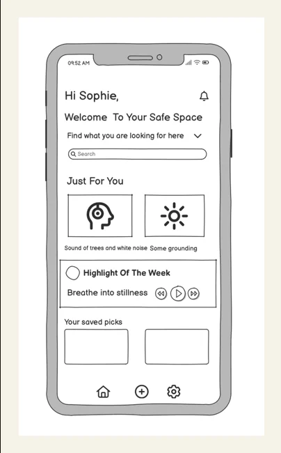
Low-fidelity wireframe of the home screen: personal greeting, search, a Just For You row, Highlight of the Week audio card, saved picks, and a three-item bottom navigation.
Home — the day, at a glance
  • Greeting by name; emotional framing over metrics
  • Two suggested sessions, no more, to avoid a decision
  • Audio highlight sits above the fold for Thabo's guided use
  • Three-item navigation: home, add, settings
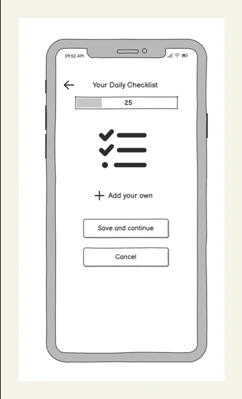
Low-fidelity wireframe of the daily checklist screen: a progress bar, a short list of ticked items, an add-your-own control, and save and cancel actions.
Daily checklist — one tap per habit
  • Progress bar at the top answers “how am I doing?” first
  • Items are tap targets, not form fields
  • “Add your own” keeps customisation optional
  • Save and cancel are separated to prevent mis-taps

10 — Medium fidelity

The daily checklist, built

This is the screen the whole product rests on, so it's the one I took furthest. It's live below — tap the habits and watch the progress bar respond. The immediate feedback is the point: the reward has to arrive at the moment of the tap, not at the end of the week.

9:41▮▮▮ ᯤ ▰

Your daily checklist

0% done0 of 5
+ Add your own
Save and continue
Cancel
Interface decisions
  • Progress first. The bar sits above the list because “how am I doing?” is the question people open the app to answer.
  • Completed items soften rather than vanish. A finished habit stays visible and dims — the list is a record of the day, not a queue to empty.
  • Percentage and count together. Sophie reads the percentage; Thabo reads “3 of 5”. Both were in the research, so both are on screen.
  • “Add your own” is a dashed outline. It reads as optional. Customisation is available without implying setup is unfinished.
  • Save and cancel are stacked and distinct. One is filled, one is outlined, and neither sits under a thumb by accident.

11 — Decisions, validation & next

Tracing every choice back

Four decisions carry most of the design. Each one exists because of something specific Sophie or Thabo said.

01

Guided onboarding with preset habits

Both personas described feeling stuck when asked to define wellness goals from nothing. The app opens with a short, beginner-friendly sequence and templates for the common goals — water, movement, mindfulness — so the cognitive cost of starting is close to zero and the app is useful within a minute.

02

Context-aware reminders

Neither persona struggles with intent; they struggle with timing. Reminders fire against logged behaviour and time of day rather than a fixed schedule, which delivers the nudge when it can still be acted on and keeps the total volume low enough to stay credible.

03

Progress shown as a pattern

Sophie wanted feedback she could act on; Thabo needed to see that small efforts add up. The dashboard shows completion, streaks and trends over time, with recommendations drawn from the person's own history rather than from population averages.

04

Breathing exercises one tap from home

Stress was the barrier both personas named, and it's the one most likely to break a streak. Guided breathing sits on the home screen rather than inside a menu, because the moment it's needed is not a moment for navigating.


How I'd validate it

Three methods, chosen to answer different questions about the medium-fidelity prototype.

Usability testing

Participants matching both personas complete standard tasks — logging a habit, reviewing progress, starting a breathing session — to surface navigation trouble and friction.

Cognitive walkthrough

A step-by-step expert review of learnability and feedback clarity, aimed specifically at the onboarding and habit-tracking flows where first-run abandonment happens.

Think-aloud sessions

Participants narrate their reasoning while working, catching hesitation and misread affordances in real time rather than in a debrief.


What I'd do next

  • Test the day-four dip. The journey map predicts it; a two-week diary study would confirm whether it's real and when it lands.
  • Prototype automatic tracking. Wearable and sensor input was the single highest-value opportunity in the journey map and hasn't been designed yet.
  • Design the recovery state. The app currently has no considered answer for a broken streak, which is the exact moment people leave.
  • Run a contrast and target-size audit. Thabo's beginner profile makes accessibility a functional requirement here, not a final check.

Next case study — 04

LuxxStays →

Hotel booking platform · Web