Case study 04 · UX research & UI design
A hotel booking platform rebuilt around the questions people actually ask before they book.
I watched people try to book a room on an existing booking site and recorded every place they hesitated. Almost none of it was about aesthetics. People stalled where the page failed to give them something to decide with — a filter, a rating, a room size, a photograph that wasn't the fifth of five.
01 — Overview
LuxxStays lets someone find a hotel, compare it honestly against the alternatives, and book it without leaving the site to check something elsewhere.
The brief was a booking system: browse hotels, compare prices, reserve a room. What the research turned it into was something narrower and more useful — a system for building enough confidence to commit. Every hesitation I recorded came down to a missing piece of evidence, and almost every design decision that followed was about putting that evidence where the decision happens.
The outcome is a responsive site built around three moments: a search that understands where you want to go, results you can actually narrow, and a room page that answers the questions people were previously opening new tabs to answer.
02 — The problem
One participant summed the site up on the landing page: “it's very welcoming, it's as if I am already on vacation.” Two screens later the same person was stuck, because there was no way to filter to a budget and the destination field was a drop-down containing every country on earth.
That gap — a beautiful surface with nothing underneath it to decide with — repeated through the whole flow. Ratings only appeared after a hotel had been selected. There was no reviews section. Rooms had five photographs of poor quality and no stated size. Add-ons amounted to alcoholic beverages. The cancellation penalty was 50%, and you found that out late.
The goal
A booking flow where every question a person asks is answered on the screen they ask it on — and where the commitment is only requested once the confidence has been earned.
03 — Process
Each phase produced the input the next one needed. The affinity board came out of the testing notes; the journey map came out of the affinity board; the flow came out of the journey map. Nothing here was made to fill a portfolio slot.
04 — Usability testing
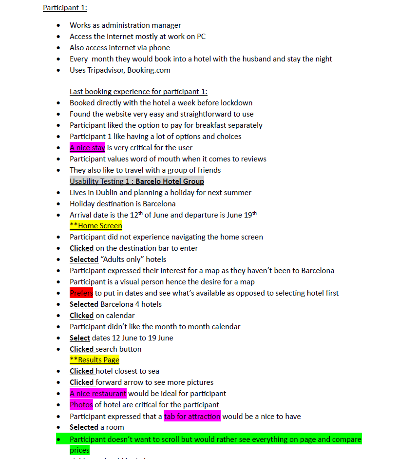
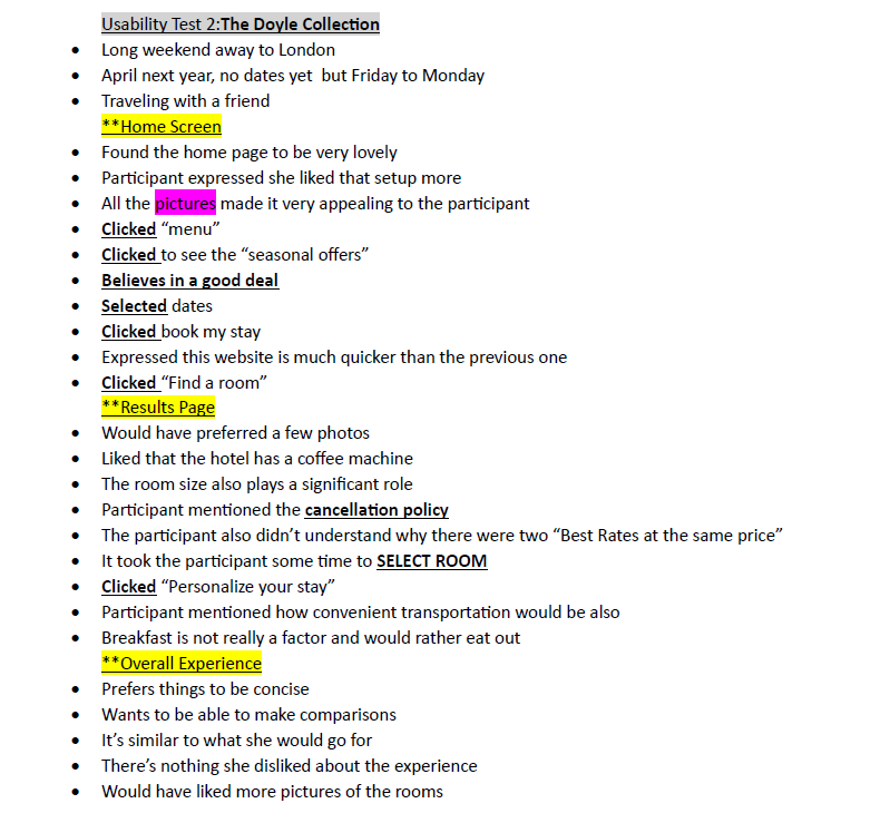
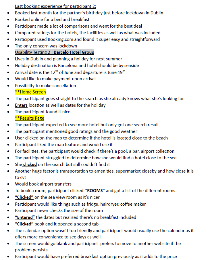
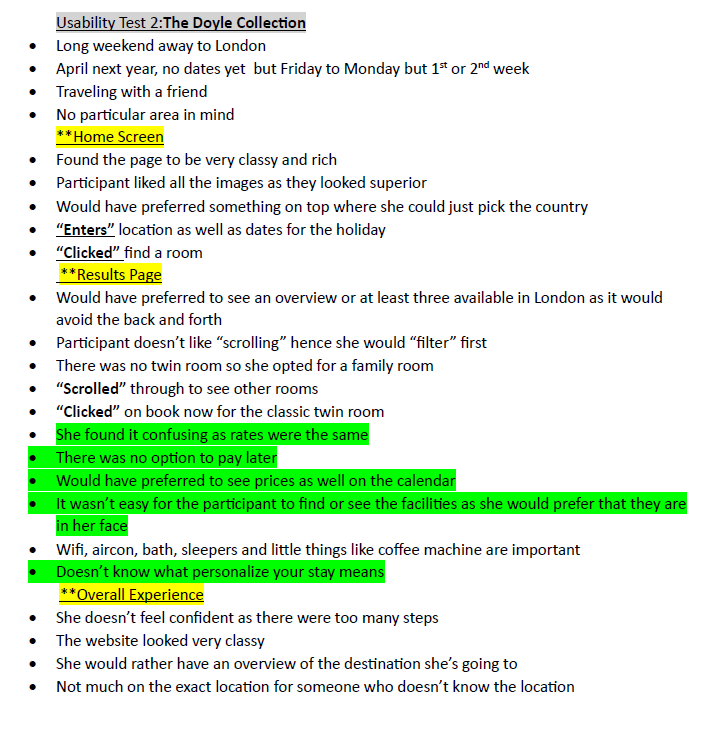
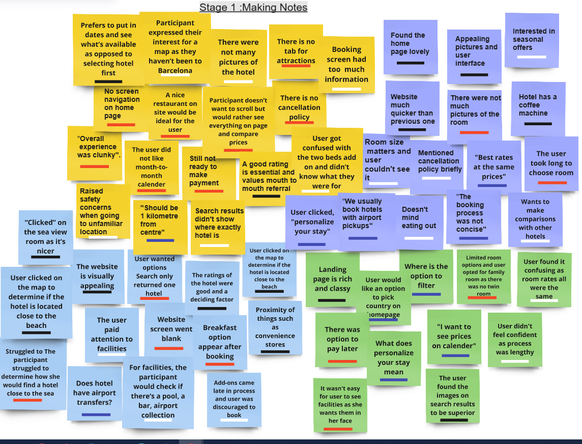
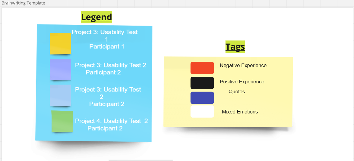
Rather than ask people what they wanted from a booking site, I gave them a task on a site that already existed and wrote down what happened. Sessions were moderated and note-taking was live, colour-coded as it went: what the participant did, what they said, and where the interface got in the way. These four pages are the raw record.
Click any artefact to view it full size
“I wish I could somehow filter from low to high prices. The process would be quicker.”Participant · search results
“I would prefer to type in the destination instead of the drop-down. It's time-consuming.”Participant · destination
“I expected more pictures of the room.”Participant · room selection
“I prefer to have an option to cancel whenever I want to.”Participant · checkout
05 — Affinity mapping
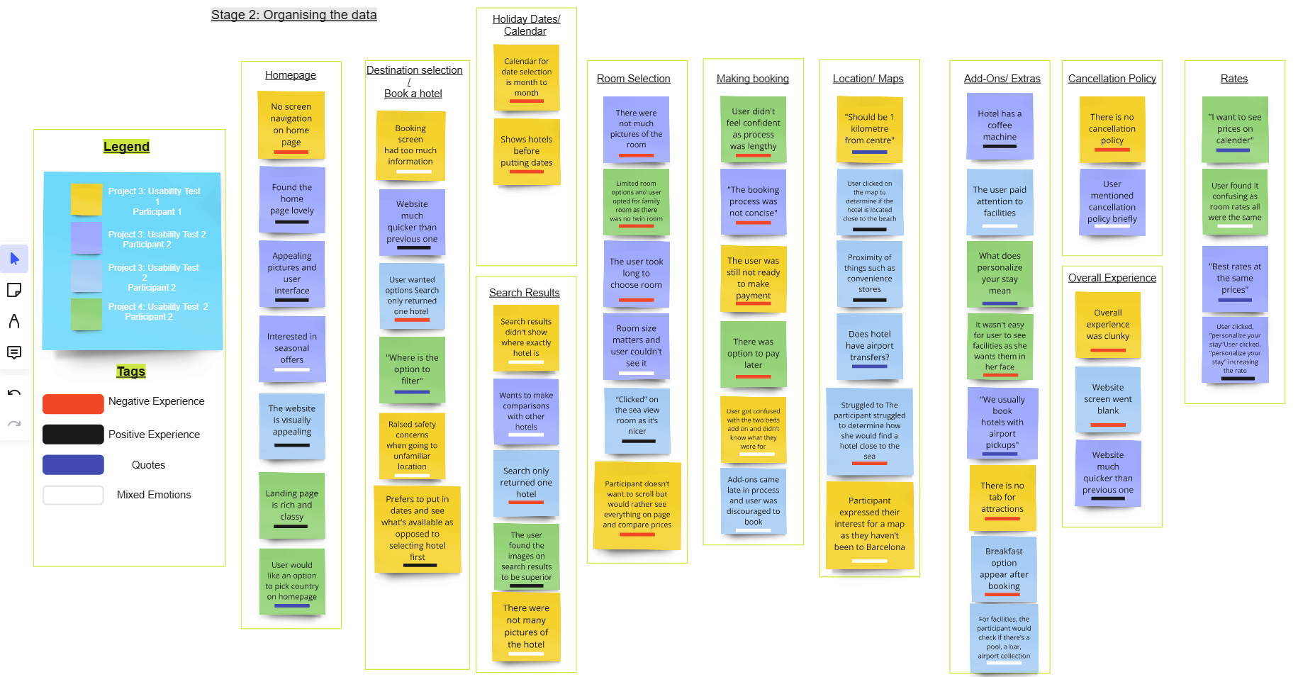
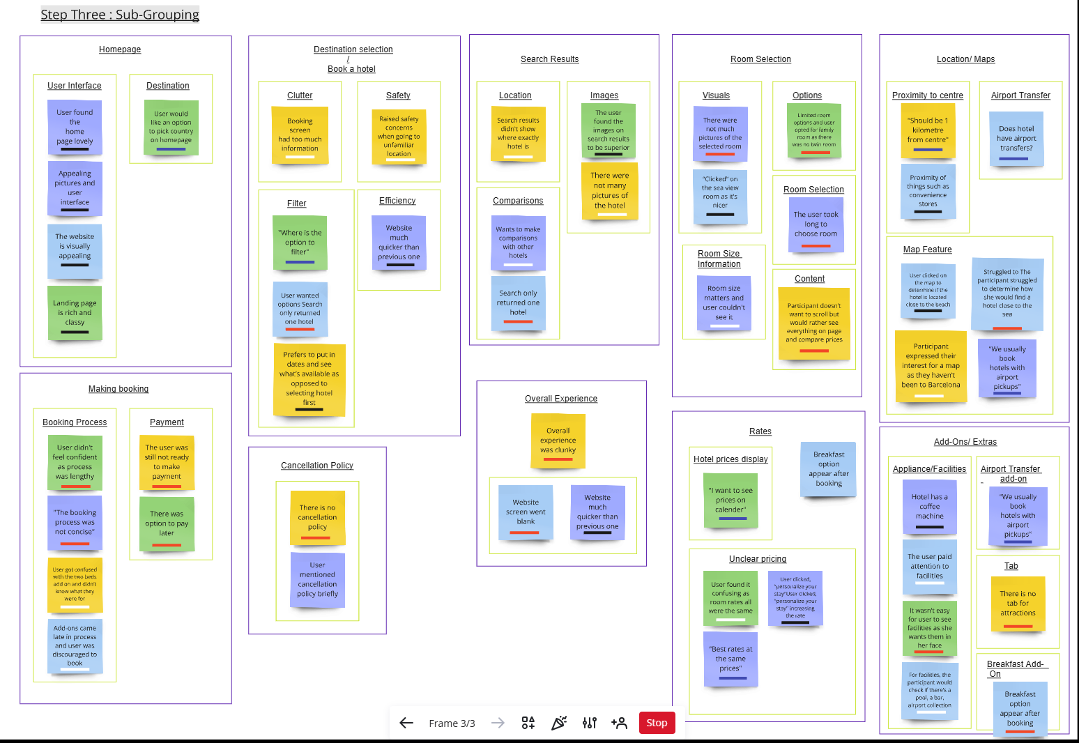
Every observation went onto a note, colour-coded by whether it was something the participant did, something they said, a pain point or a positive. Then the board was worked in three passes: get everything down, organise into rough piles, then split the piles into sub-groups specific enough to design against.
Homepage · Making a booking · Destination selection · Cancellation policy · Search results · Room selection · Overall experience · Rates · Location and maps · Add-ons and extras · Filters
Read in one go, the board says something quite specific. Almost nothing sat under “Homepage” — people liked it. The weight was under selection and comparison: filters, room size, images, prices, proximity to the sea, airport transfers, whether the coffee machine exists. All of it is evidence for a decision, and none of it was on screen at the point the decision was being made.
06 — Findings
Each one is paired with the decision it produced. If a design choice below can't be traced to a note on the board, it didn't get made.
There was no option to filter to a preference. Selecting a destination meant scrolling a drop-down of every country. Participants worked around it by opening more tabs, and one gave up on comparing altogether and took the first result that looked plausible.
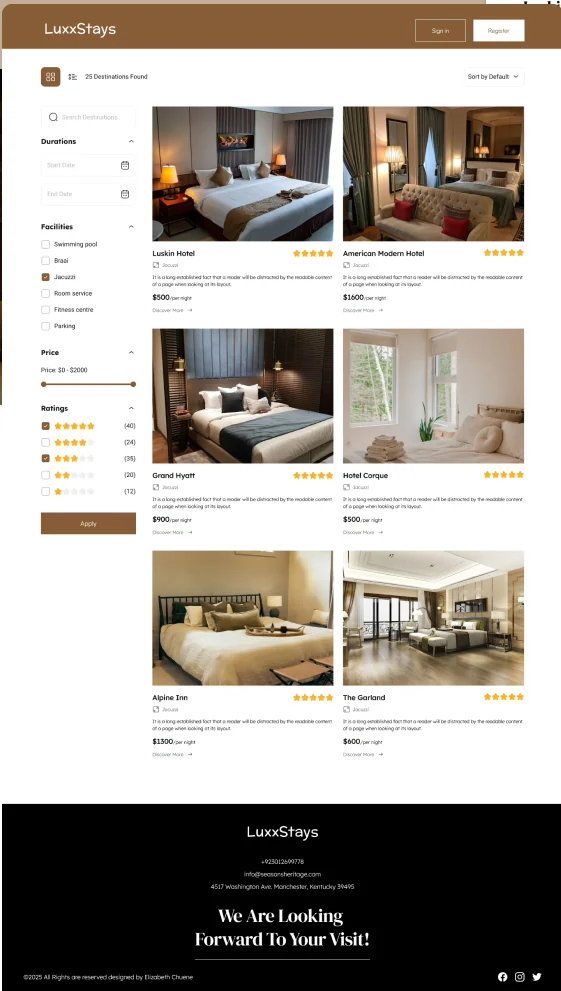
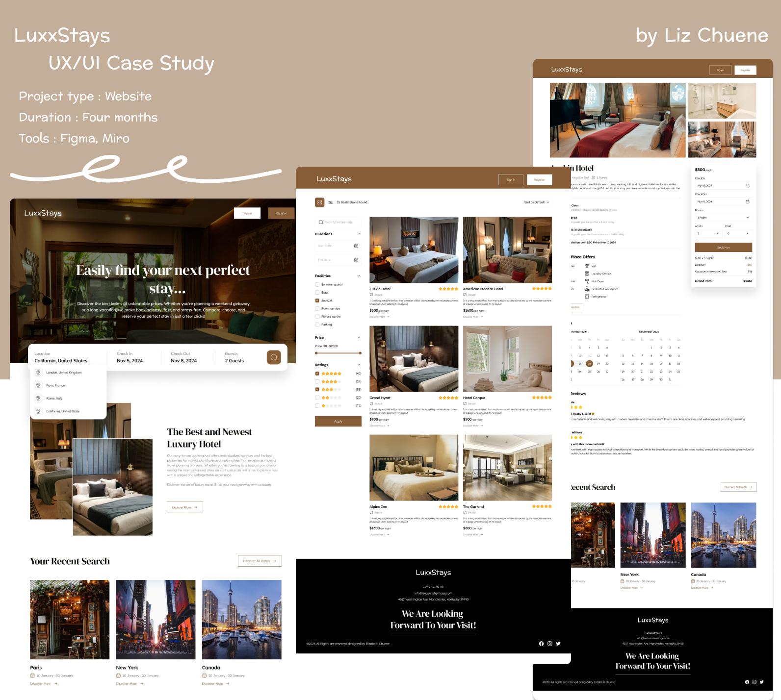
A persistent filter rail on results — price range, facilities, star rating, length of stay — with a type-ahead destination field on the home search. Narrowing happens before browsing, and the filters stay visible so the person can see what they've excluded.
Ratings only appeared once a hotel had been selected. There was no reviews section at all. Rooms carried five images, described as poor quality, and no stated size — “the room size is not mentioned on the page.” People were being asked to choose between things they couldn't see.
Rating, nightly price and a representative photograph moved onto the result card itself. The room page carries a full gallery, room detail, what the place actually offers, and guest reviews with names attached — so comparison happens on the page instead of in another tab.
“The booking process was not concise.” Participants got confused between two beds and didn't know what fare they were on. Add-ons appeared so late that one person was discouraged from booking. Cancellation carried a 50% penalty, mentioned only briefly.
A booking summary panel that stays on screen through the whole flow: dates, guests, rooms, the line items, the discount, the occupancy tax and a grand total that updates as choices are made. Policy and add-ons surface at room selection, not at payment.
07 — Customer journey map
Mapping one traveller from “I'm going on holiday” to “payment complete” put the emotional curve next to the behaviour that caused it. The high point is the landing page. The two lows are filtering and add-ons — both moments where the person wants to narrow something down and the interface won't let them.
.png)
Click to view full size · open in Figma
08 — Structure
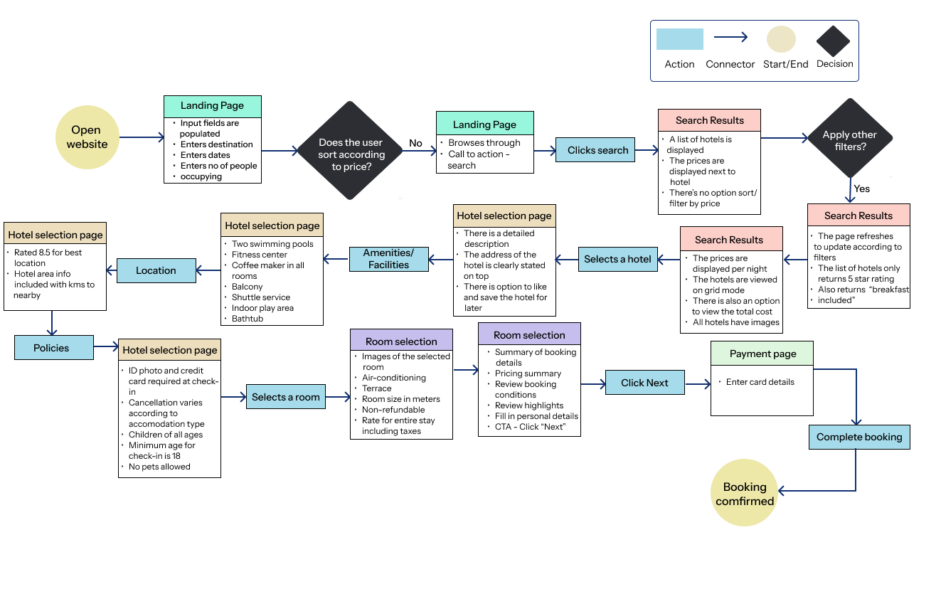
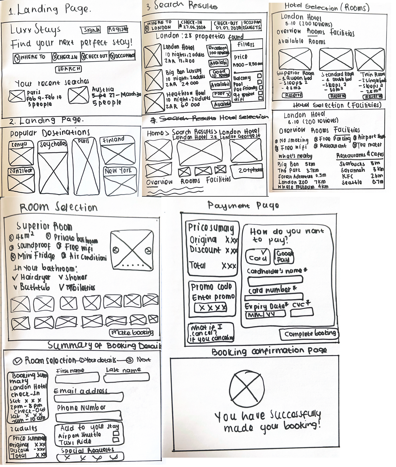
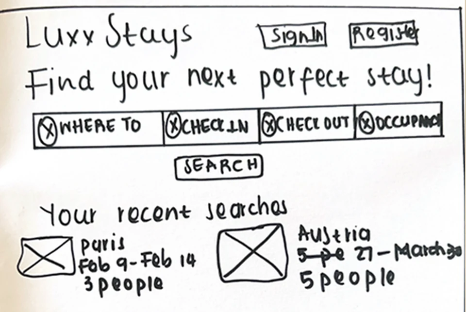
The flow diagram exists to count steps. Every branch that didn't move the person closer to a confident decision was a candidate for removal — and the sketches that followed were deliberately rough, so feedback stayed on where things go rather than what colour they are.


09 — High fidelity
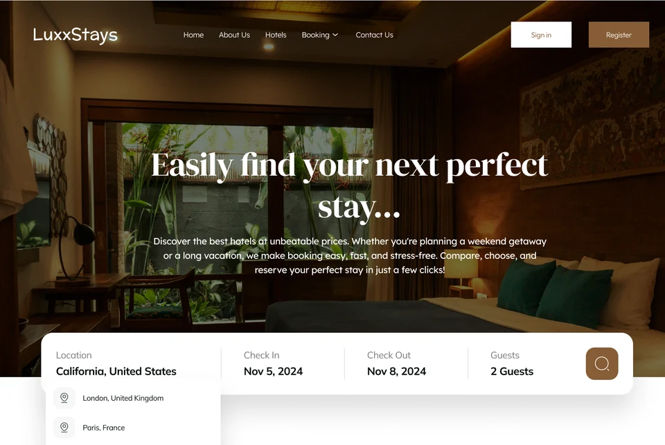
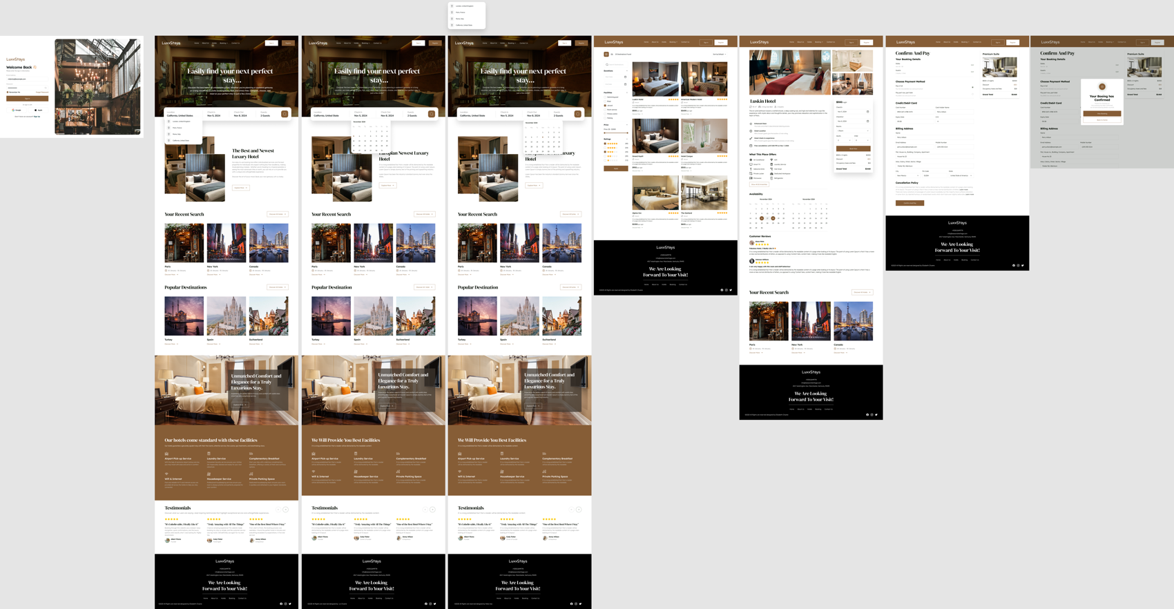
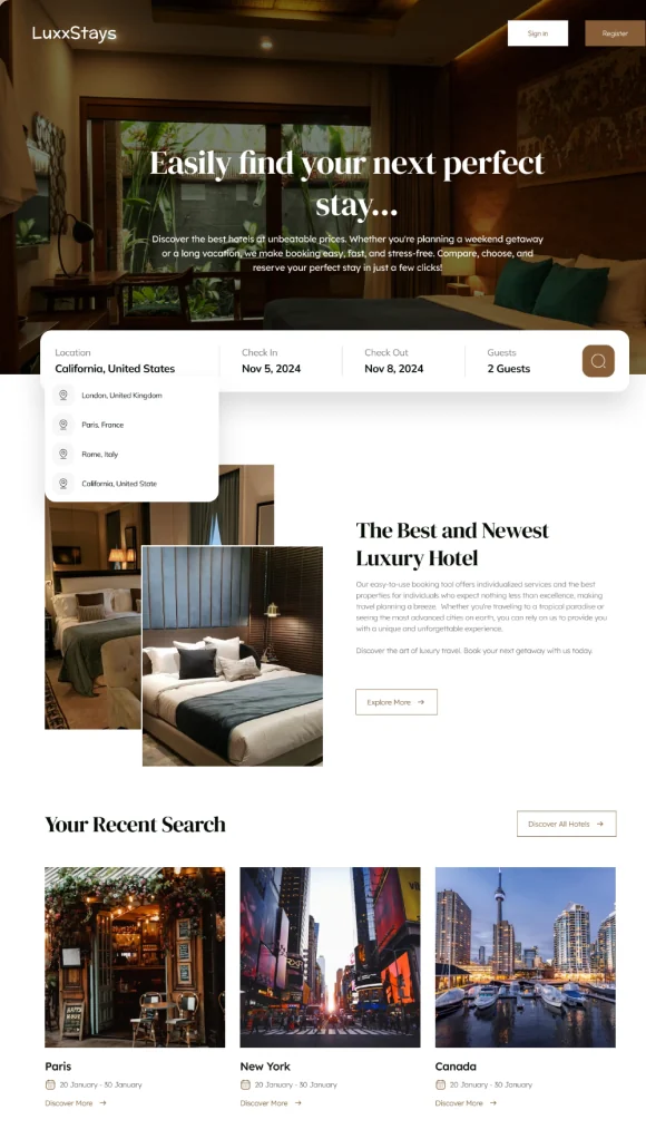
Warm, photographic, and deliberately quiet around the content — the hotels have to be the loudest thing on the page. Below is the full screen set as built in Figma, followed by the decisions that shaped it.
SketchFinal

Click to view full size

10 — Reflection
This was my first end-to-end project and it shows in one place: I tested the old site thoroughly and the new one lightly. The redesign answers every problem the research found, but “answers the problem” and “works for a stranger” aren't the same claim, and only the first one is evidenced here.
Next case study — 02
PennySavvy →
Student savings & budgeting · Mobile