
← All work

Case study 02 · UX research & UI design

PennySavvy

A savings app for students whose money runs out before the month does.

Fifty-eight students answered the survey. Eight in ten had no savings account. Three in four had never drawn up a monthly budget. Half had set no financial goals at all — and the ones who had said nobody had ever shown them how to keep one. This is what I built for them.

Role
UX research, UI design, prototyping
Duration
24+ weeks
Platform
Mobile app, iOS & Android
Methods
Survey (n=58), interviews, competitive analysis, personas, empathy mapping, IA
Output
15+ screens, lo-fi through high fidelity

01 — Overview

Saving is a skill nobody teaches

PennySavvy helps university students set a goal, lock money away from themselves, and understand where the rest of it went.

The premise sounds like a budgeting app, and the interface is one. But the research pointed at something underneath the tooling: students weren't failing to save because they lacked an app. They were failing because nobody had told them what a realistic target looks like, because their income is irregular and partly spoken for, and because everyone around them is spending.

So the product does four things: it makes a goal concrete, it puts a wall between the student and the money, it explains the decision in language they'd actually use, and it treats financial literacy as a feature rather than a footer link.

02 — The problem

Money arrives, then it's gone

What students are up against

Student income is irregular, partly obligated and mostly unmonitored. An allowance lands, part of it goes home, part of it goes on eating out, and the month ends before anyone has written down where it went. The apps on the market are built for salaried adults — one competitor requires a South African ID number to register, which rules out a chunk of the campus straight away.

And there's a social layer the tooling ignores completely. Students told me they feel too young to be saving, that long-term goals are impossible to achieve, and that they'd rather spend on experiences. Saving isn't just unaffordable, it's unfashionable.

Product goals

What I set out to build

  • Improved budgeting — help students allocate a month's money to what matters before it's spent
  • Improved savings habits — prioritise saving early, when the amounts are small and the habit is cheap
  • Improved financial literacy — teach inside the product, not in a blog nobody opens
  • Improved access to investing — show that investing doesn't require millions

03 — Process

Research, wireframes,
fidelity, testing

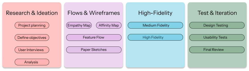
Twenty-four weeks, run as a loop rather than a line — every round of feedback sent something back a stage.

The design process diagram: research and ideation, flows and wireframes, high fidelity, test and iteration.
The process, as documented in the project
1

Research & ideation

  • Project planning
  • Define objectives
  • Target audience & competitors
  • Survey and interviews
  • Analysis
2

Flows & wireframes

  • Empathy map
  • Personas
  • Challenge → feature matrix
  • Feature flow & IA
  • Paper sketches
3

High fidelity

  • Medium-fidelity wireframes
  • High-fidelity screens
  • Visual language
4

Test & iteration

  • Design testing
  • Usability tests
  • Final review
  • Iteration on feedback

04 — Research

Fifty-eight students,
one questionnaire

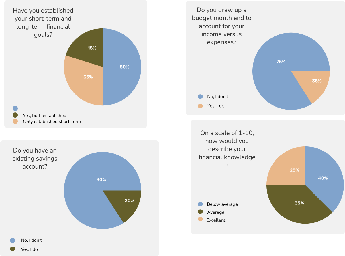
The survey ran through Google Forms across undergraduates, postgraduates and young professionals — 58 complete responses. I wanted numbers rather than anecdotes, because the assumption I was testing was uncomfortable: that students know they should save and simply don't. The results said something more specific.

80%have no existing
savings account
75%never draw up a
monthly budget
50%have set no financial
goals at all
40%rate their financial
knowledge below average
Four survey result charts: financial goals, monthly budgeting, savings accounts and self-rated financial knowledge.
Survey results — Google Forms, 58 respondents

What the numbers changed

If most respondents had a savings account and no discipline, the product would be a tracker. They didn't. Four in five had no account at all, which makes the first job of the app onboarding into saving rather than reporting on it.

The knowledge answer mattered just as much. When 40% of people rate their own financial knowledge below average, features that assume fluency — interest, compounding, portfolios — need to teach before they ask. That single finding is why financial literacy articles are a first-class part of the app and not a marketing page.

Target audience: undergraduates, postgraduates and young professionals.
Who the product is for

Click any artefact to view it full size

05 — Competitive analysis

What the market gets wrong about students

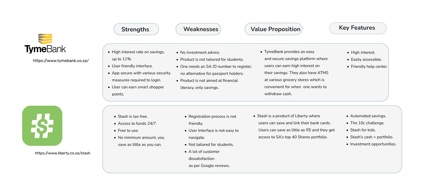
I looked closely at two products students already had opinions about — TymeBank and Stash — across strengths, weaknesses, value proposition and key features. Both are good products. Neither is built for someone whose income is an allowance.

Competitive analysis of TymeBank and Stash across strengths, weaknesses, value proposition and key features.
Competitive analysis — TymeBank and Stash

The gap

Neither product is tailored to students. One requires an SA ID number with no alternative for passport holders, which excludes international students entirely.

The blind spot

High interest and automated savings are strong features, but neither product treats financial literacy as its job. For a first-time saver, that's the part that's missing.

What I took from it

Keep the good ideas — save as little as R5, automate it, make it visible — and add the two things missing: teaching, and a registration path that doesn't turn people away at the door.

06 — Personas

Two students, two kinds of pressure

The survey split into two situations that need different things from the same app: money that comes from a parent, and money that comes with obligations attached. Designing for both stopped the product from becoming a toy for one and a burden for the other.

Persona 01 — Funded, but never in surplus

Yuvania Maharaj

“My allowance never lasts until the end of the month.”

  • 21
  • Wits University, Johannesburg
  • Accountancy, 3rd year
  • Only child
  • Funded by parents
Background

Working towards becoming a Chartered Accountant. Lives off campus with a car, both covered by her parents. Her allowance goes mainly on eating out and social activities — which is exactly the money that could be saved, if anything made that visible.

Goals
  • Open a savings account
  • Be financially literate before graduating
  • Hold a fixed budget every month
Pain points
  • No savings app is built for students
  • Fears having no income if a job doesn't follow graduation
  • The allowance doesn't stretch to month end
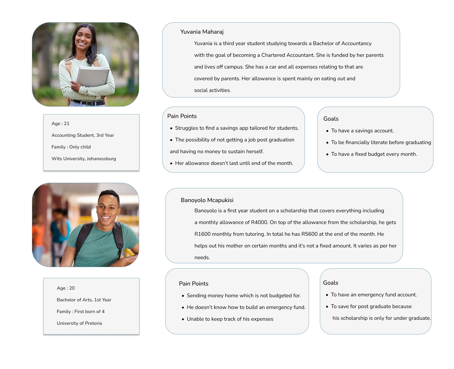
Persona 02 — Income with obligations attached

Banoyolo Mcapukisi

“Some months I send money home. It's never the same amount.”

  • 20
  • University of Pretoria
  • Bachelor of Arts, 1st year
  • First born of four
  • Scholarship + tutoring
Background

A scholarship covers his fees plus R4 000 a month; tutoring adds R1 600. Of that R5 600, an unpredictable share goes to his mother depending on what she needs. His scholarship only covers undergraduate study, so postgrad is a bill he can already see coming.

Goals
  • Build an emergency fund
  • Save towards postgraduate study
  • Know where his money actually goes
Pain points
  • Sending money home is never budgeted for
  • Doesn't know how to start an emergency fund
  • Can't keep track of his expenses
The two PennySavvy personas as designed: Yuvania Maharaj and Banoyolo Mcapukisi.
Personas as delivered

07 — Empathy map

The part money apps ignore

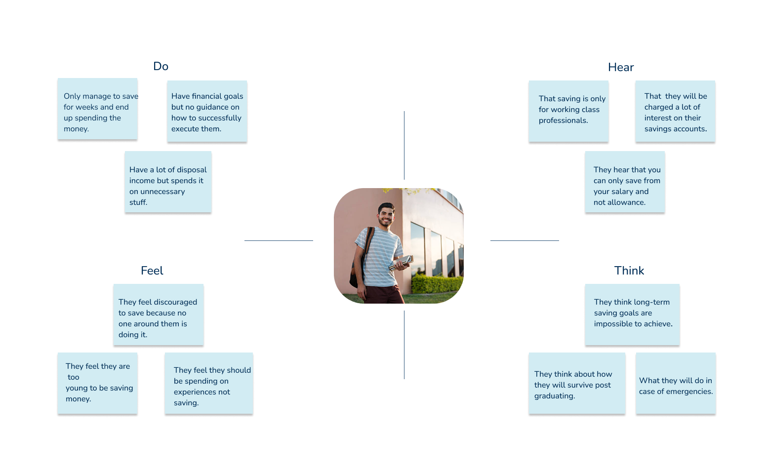
Mapping what students do, hear, think and feel surfaced the real obstacle — and it isn't financial. Students believe saving is something other people do later, with a salary, once they're old enough. You can't budget your way past a belief; you have to design against it.

Do
  • Manage to save for a few weeks, then spend it
  • Set financial goals with no guidance on how to execute them
  • Have disposable income and spend it on things they don't need
Hear
  • That saving is only for working-class professionals
  • That they'll be charged a lot of interest on savings accounts
  • That you can only save from a salary, not an allowance
Feel
  • Discouraged, because nobody around them is saving
  • Too young to be saving money
  • That they should be spending on experiences instead
Think
  • Long-term saving goals are impossible to achieve
  • About how they'll survive after graduating
  • About what they'd do in an emergency
The PennySavvy empathy map with do, hear, feel and think quadrants.
Empathy map as delivered

What it changed

Three design consequences came directly out of this map. Goals get broken into a time frame and a calculated monthly amount, so “impossible” becomes a number. Saved money gets locked, because the failure mode isn't not saving — it's saving and then spending it back. And peers can be invited in, because the strongest thing working against a student saver is that nobody around them is doing it.

08 — From challenge to feature

Every feature has a receipt

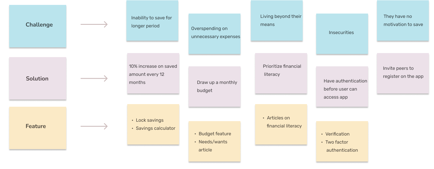
This is the artefact I'd defend in a review. Nothing gets built unless there's a line above it saying which research finding it answers — and nothing found in research is allowed to disappear without a decision.

Challenge
Inability to save over a longer period
Overspending on unnecessary expenses
Living beyond their means
Insecurity about money in an app
No motivation to save
Solution
Reward the distance: 10% increase on the saved amount every 12 months
Make the month explicit — draw up a budget before it's spent
Prioritise financial literacy inside the product
Authenticate before any access to the account
Bring their peers in
Feature
Lock savings · Savings calculator
Budget feature · Needs-vs-wants article
Financial literacy articles
Verification · Two-factor authentication
Invite peers to register

↔ Scroll to see the full matrix

The challenge, solution and feature matrix as designed.
The matrix as delivered

09 — Architecture & sketches

Five places, not fifteen

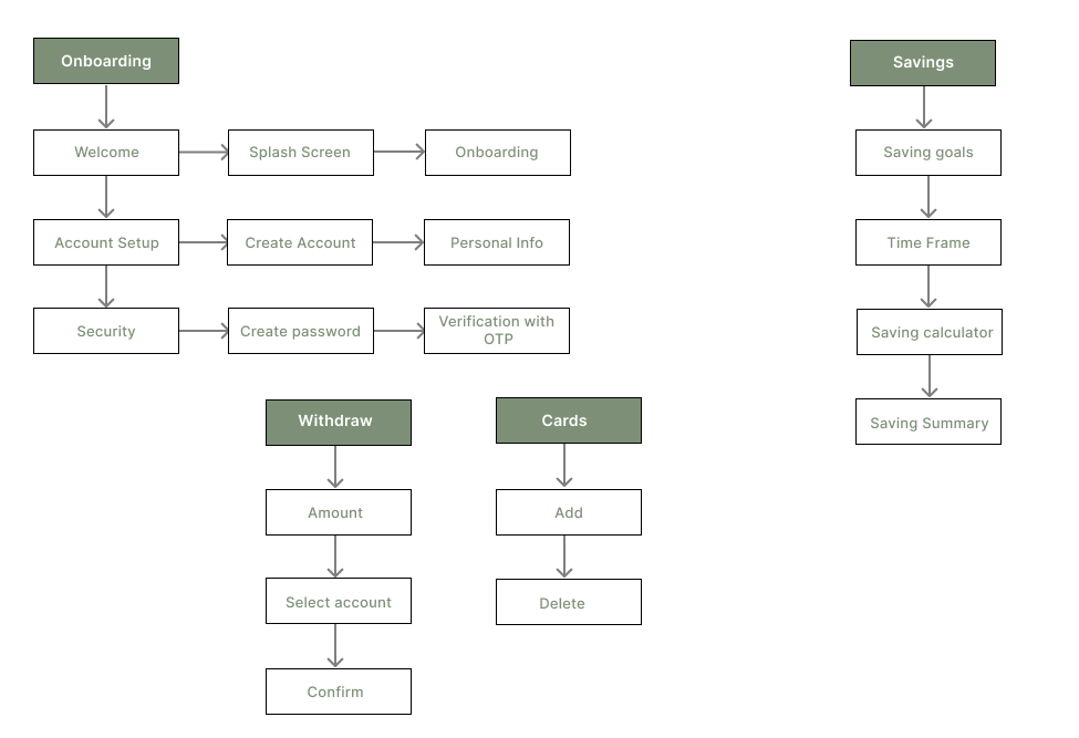
The information architecture keeps the app to five territories — onboarding, savings, withdraw, cards and community. Onboarding is the longest branch on purpose: for four in five of these students it's the first savings account they'll ever open, and it has to hold their hand through account setup, security, password and OTP without ever feeling like paperwork.

Information architecture: onboarding, savings, withdraw, cards and community branches.
Information architecture

Structural decisions

  • Savings is a four-step branch, not a form: goal, time frame, calculator, summary. The calculator is what turns an ambition into a monthly number.
  • Withdraw is deliberately three steps. Amount, account, confirm. Friction here is the feature — this is the wall between the student and the money.
  • Cards are add and delete only. Anything more belongs to the bank, not to a student savings app.
  • Community sits at the top level, because peer motivation was a research finding, not a growth tactic.
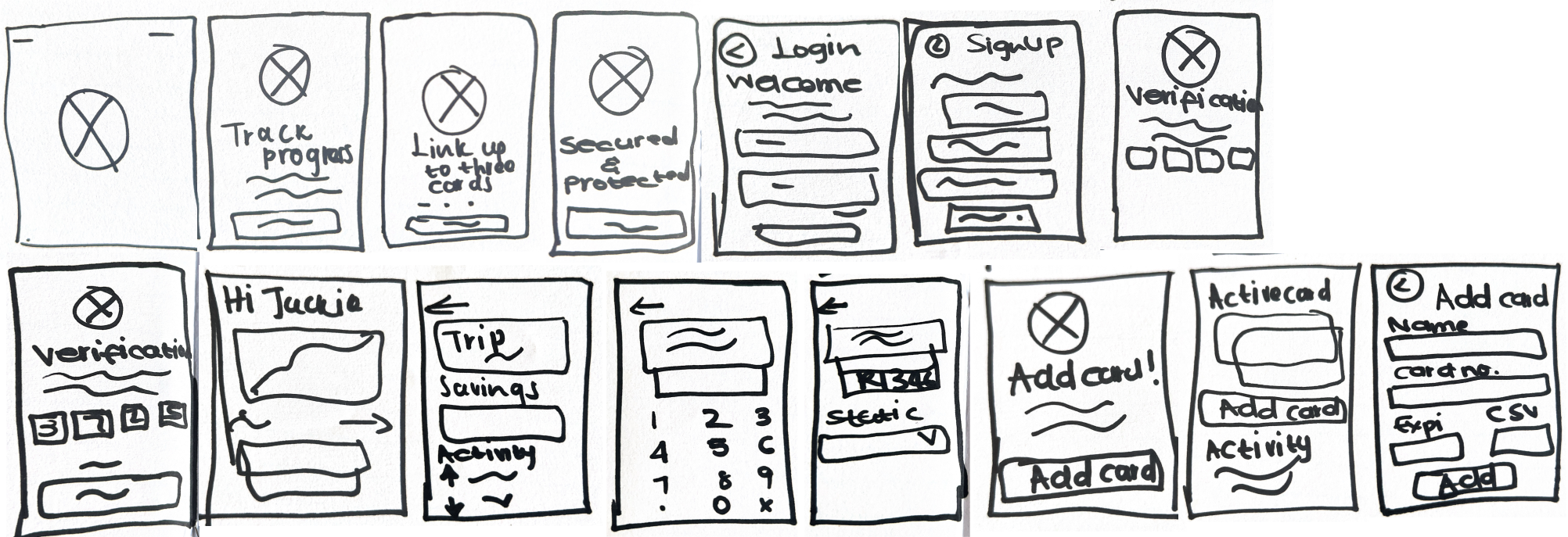
Hand-drawn sketches of the PennySavvy screens.
Sketches — fast, cheap, disposable

10 — Medium to high fidelity

Built to be understood at a glance

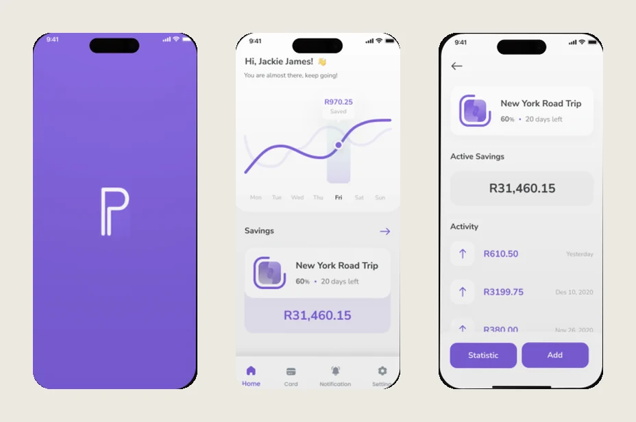
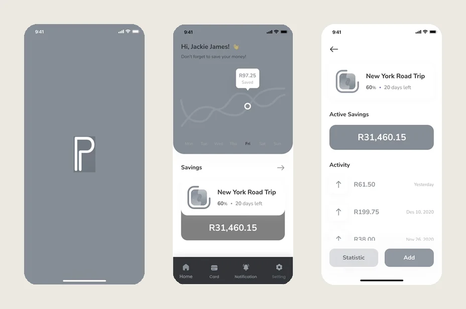
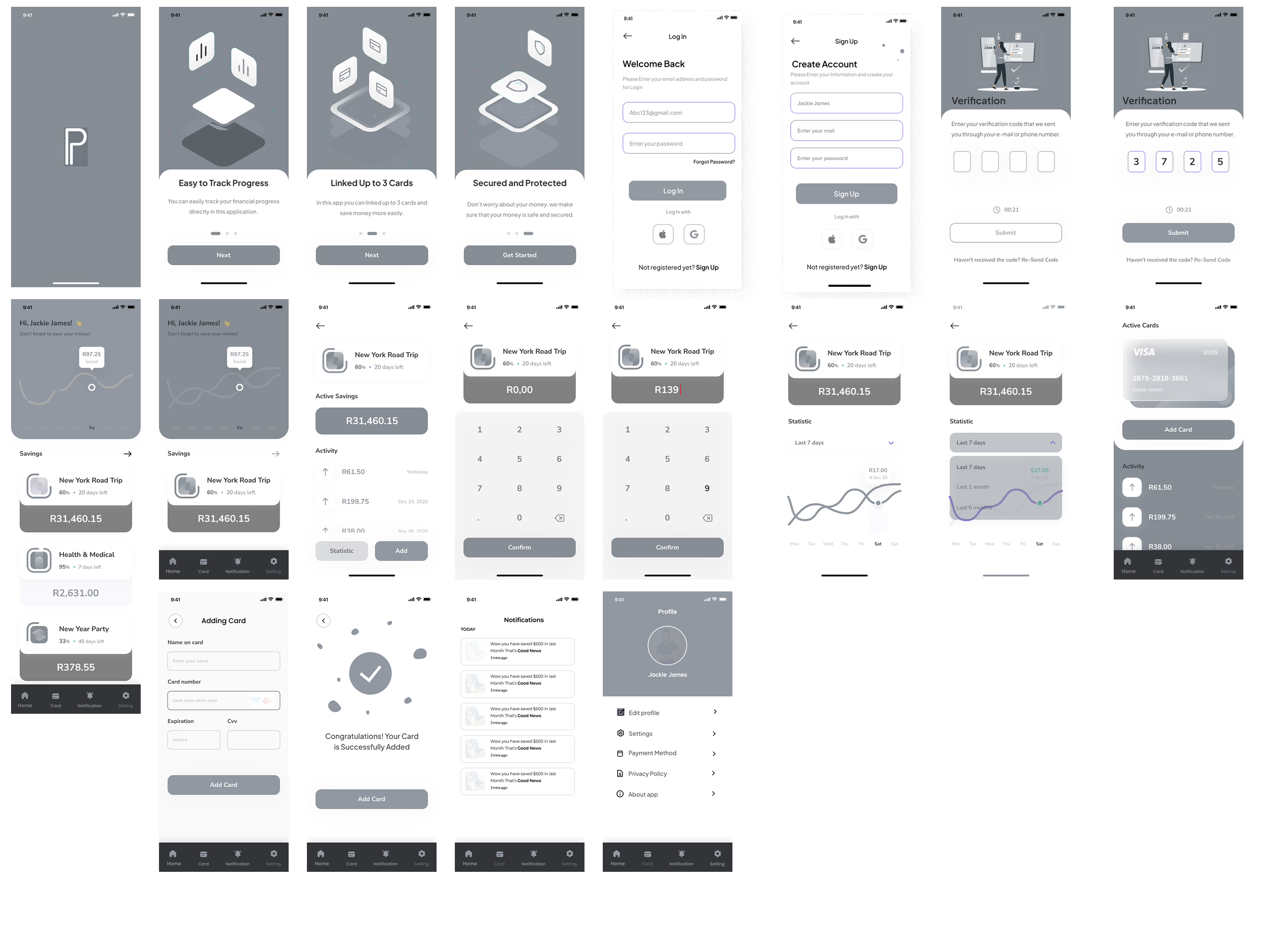
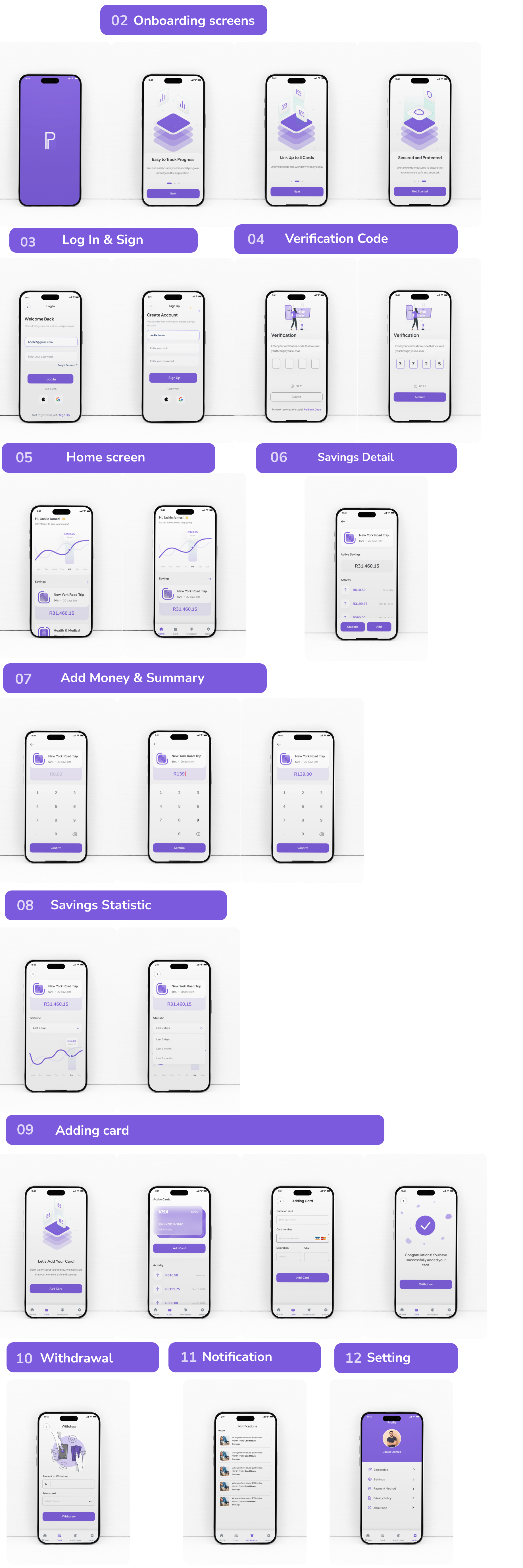
Medium fidelity settled layout, flow and hierarchy while it was still cheap to change; deliberately grey so feedback stayed on structure. High fidelity added the one thing the research demanded of the visual language: clarity about the number.

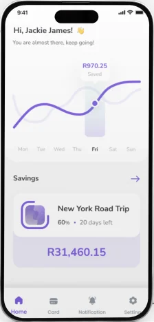
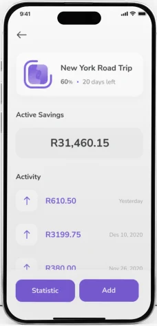
The same three screens in high fidelity, in PennySavvy violet. Medium fidelity splash, home and savings detail screens in grey. Medium fidelityHigh fidelity
Drag across — the same three screens, grey structure to finished surface
Medium fidelity wireframes of the PennySavvy app.
Medium fidelity — structure before surface
The complete high fidelity PennySavvy screen set.
High fidelity — the full screen set (click to view at full height)

Interface decisions

  • The balance is the biggest thing on screen. For a first-time saver, the number going up is the entire reward loop.
  • Goals show a time frame, not just a total. “R12 000 by December” is a plan; “R12 000” is a wish.
  • Locked savings look locked. The state is visible in the interface, because the point is to feel slightly out of reach.
  • Purple, not bank blue. The competitive set is navy and corporate. This is for a twenty-year-old, and it should look like it was made for them.

And what it costs

  • Onboarding is long. Nine screens before the app is useful is a lot to ask of someone in a queue — a shortened path that defers verification is the first thing I'd test.
  • The calculator assumes stable income. Banoyolo's doesn't work like that. A variable-income mode is the honest fix.
  • Community is scaffolded, not designed. It exists in the architecture and stops there.

11 — Reflection

What I'd do next

Honest assessment

The research here is the strongest part of the project and the testing is the weakest. I have 58 people telling me what they don't do with money and no data yet on whether these screens change it. That's the gap between a well-argued design and a proven one, and I'd rather name it than decorate over it.

  • Task-based usability testing with students from both persona groups: set a goal, lock an amount, withdraw early.
  • Test the withdrawal friction. Three steps is a hypothesis. Too little and the lock is decorative; too much and people move their money elsewhere.
  • Design for irregular income. Banoyolo's obligation to his family is unpredictable, and every budgeting model in the app currently assumes it isn't.
  • Contrast audit on the purple. White on violet is borderline at small sizes and needs measuring, not eyeballing.

Next case study — 03

Cool Kind Co. →

AI-assisted customer support · Web