Portfolio · Cape Town, South Africa
I design for the moment people are about to give up.
Four products, one problem: the distance between wanting something and keeping it up. My work starts with the research that finds where people quit — the fourth day, the thirty-first minute on hold, the month that ends before the money does — and finishes with the screen that catches them there.
Selected work — 04 case studies
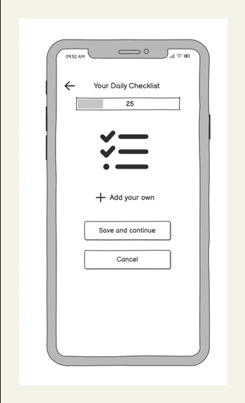
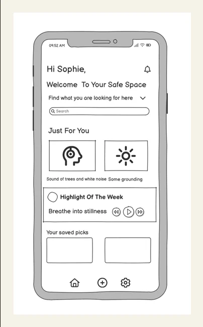
A tracker built to survive a bad week — one screen, one tap per habit, and progress shown as a pattern instead of a verdict.
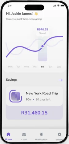
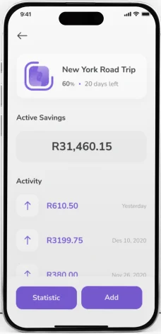
58 students surveyed, 8 in 10 with no savings account. A budgeting app for people whose money runs out before the month does.
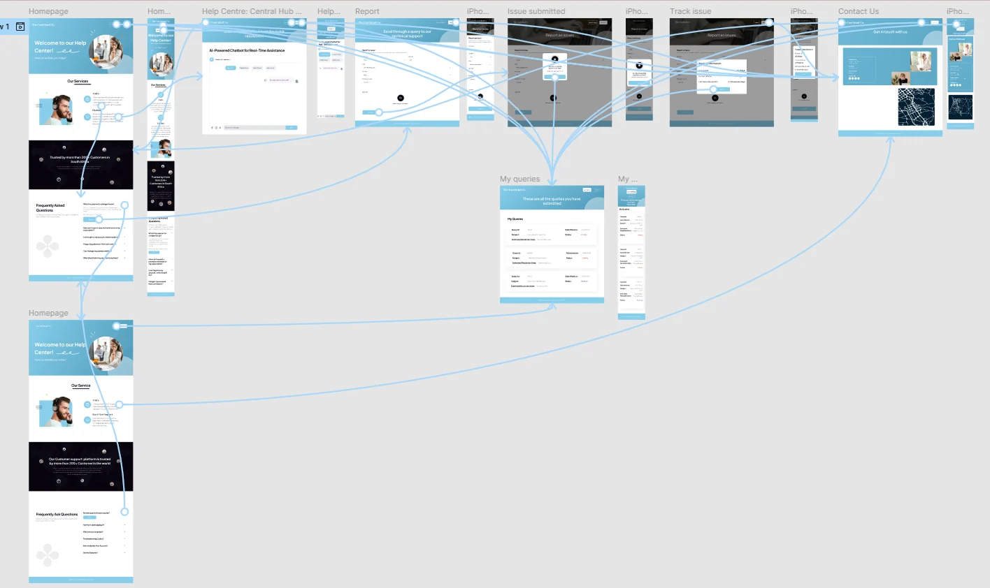
A help centre for people who have already been on hold for half an hour: self-service first, an AI assistant second, a human when it matters.
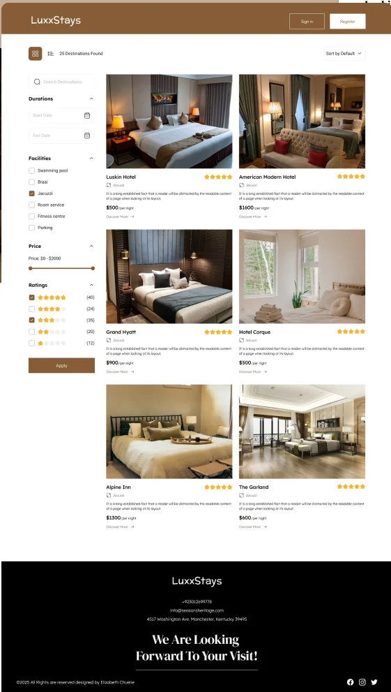
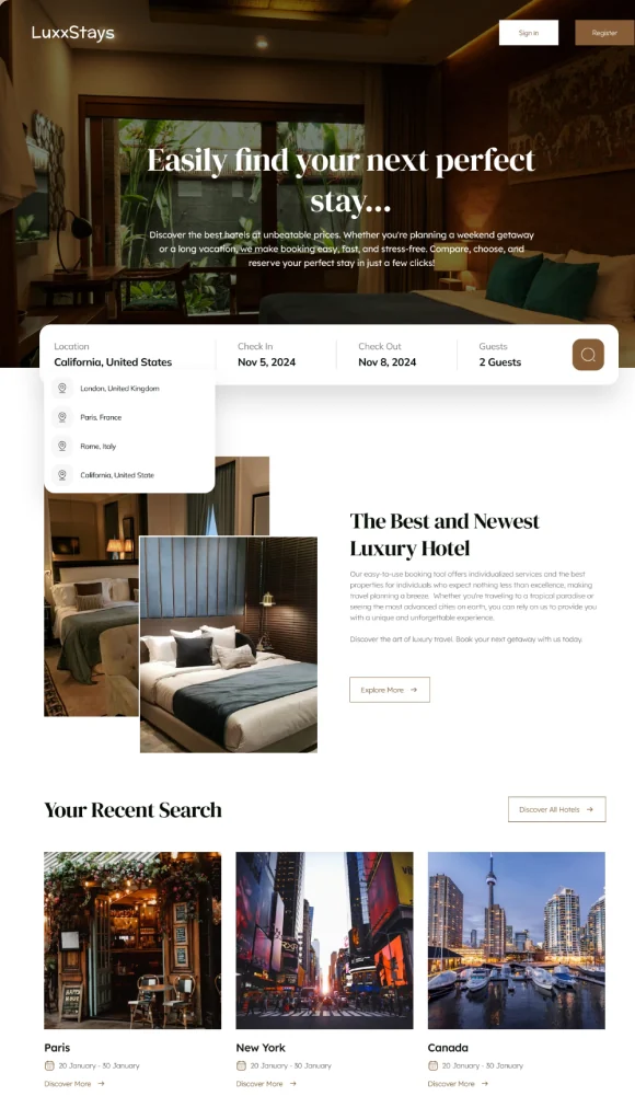
Four months, moderated usability testing and a three-stage affinity board turned into a booking flow that answers the question before it's asked.
The through-line
Every project below started somewhere specific: a moment in the research where a real person described the point at which they stopped.
I've stopped treating that as a motivation problem. People don't abandon a savings app because they've stopped caring about money — they abandon it because the app asked for more effort than the thing it was supposed to make easier. Find the exact moment, design for that, and the rest of the product mostly follows.
The week gets disrupted, two logs are missed, and the incomplete data reads as failure. HealthyHabits answers with milestones small enough to hit on a bad day.
The allowance is gone and the budget was never written down. PennySavvy answers with a lock, a calculator and a goal you can see moving.
Still on hold, repeating the same issue to a third agent. Cool Kind Co. answers by making the account fixable without the call.
There are only five images, no room size, no reviews — nothing left to decide with. LuxxStays answers by putting the evidence on the page.
Try it — how a brief actually gets written
This is the raw material from the Cool Kind Co. support research — verbatim, unsorted, the way it comes out of interviews. Affinity mapping is the step where noise becomes a design brief. Press the button and watch it happen — or drag the notes into groups yourself.
Those four groups became the four things the Cool Kind Co. help centre had to do: solve it yourself, don't repeat yourself, explain the money, get back in. See what got built →
How I work
Each one produces something the next phase needs. If an artefact doesn't answer a question that's blocking a decision, I don't make it.
Writing — published on UXmatters
Outside the case studies, I write about the people banking and payments forget: the ones on feature phones, shared devices and patchy signal, and what it takes to design for them.
Human-centered design is only as human as the variety of life it represents.
Four principles it argues for
In emerging countries, confidence serves as the fundamental currency of growth.
What it argues
About
A UX/UI designer who starts with what people say and finishes with the screen that keeps them going.
I like a problem written down before it's drawn, decisions that can be traced back to something a person actually said, and screens that stay calm when the person using them isn't.
To me research is part of design, not a phase that comes before it. Outside of that: bagels, podcasts about interfaces, and a long-running argument with myself about whether dark patterns are a design problem or a business one.